 |
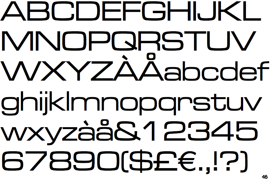
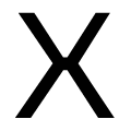
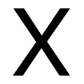
The upper-case letter 'O' is wider than it is tall.
|
 |
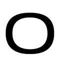
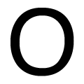
The strokes of the upper-case 'X' are discontinuous.
|
 |
The lower-case letter 'o' is wider than it is tall.
|
Note that the fonts in the icons shown above represent general examples, not necessarily the two fonts chosen for comparison.
Show Examples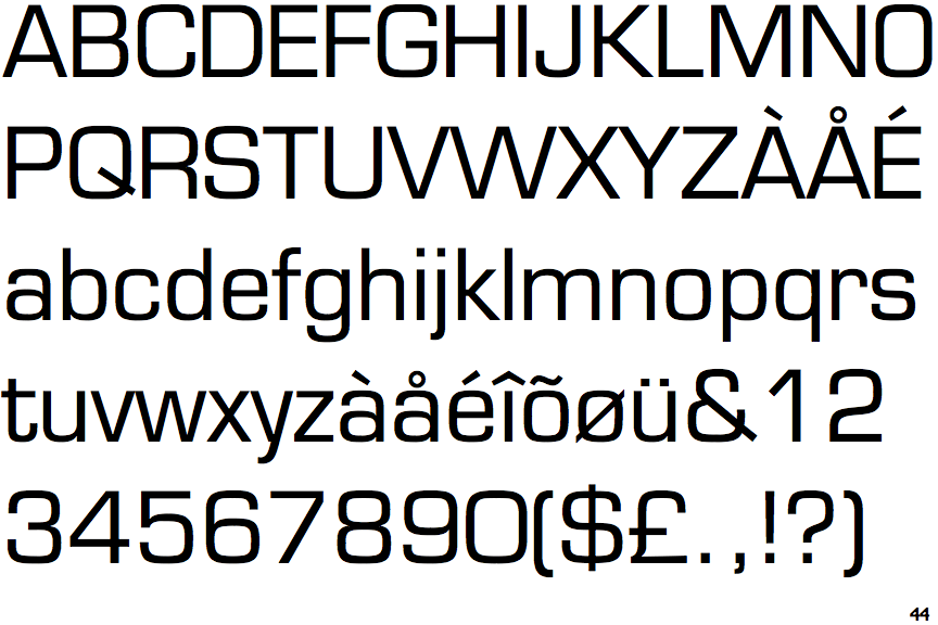
 |
The upper-case letter 'O' is taller than it is wide.
|
 |
The strokes of the upper-case 'X' are aligned.
|
 |
The lower-case letter 'o' is taller than it is wide.
|