 |
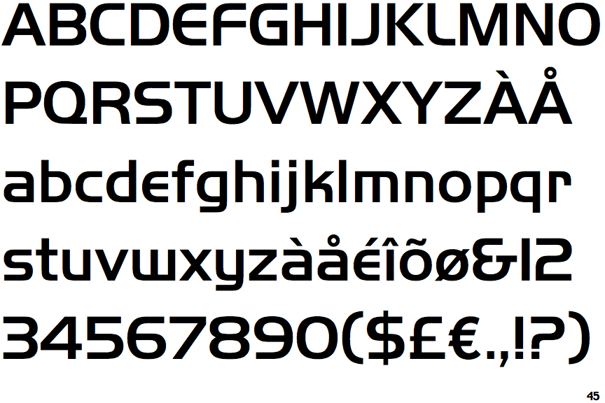
The '&' (ampersand) looks like 'Et' with a gap at the top.
|
 |
The '4' is closed.
|
 |
The diagonal strokes of the upper-case 'K' meet at the vertical (with or without a gap).
|
 |
The lower-case 'g' is single-storey (with or without loop).
|
 |
The leg of the upper-case 'R' is curved outwards.
|
 |
The upper-case 'A' has tapered verticals.
|
 |
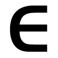
The upper-case 'E' is drawn as a 'C' with a bar.
|
 |
The lower-case 'e' is drawn as a 'c' with a bar.
|
 |
The dot on the lower-case 'i' or 'j' is square or rectangular.
|
 |
The bar of the '4' crosses the vertical.
|
There are more than ten differences; only the first ten are shown.
Note that the fonts in the icons shown above represent general examples, not necessarily the two fonts chosen for comparison.
Show Examples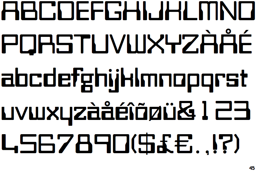
 |
The '&' (ampersand) is traditional style with two enclosed loops.
|
 |
The '4' is open.
|
 |
The diagonal strokes of the upper-case 'K' connect to the vertical via a horizontal bar.
|
 |
The lower-case 'g' is double-storey (with or without gap).
|
 |
The leg of the upper-case 'R' is straight.
|
 |
The upper-case 'A' has parallel verticals.
|
 |
The upper-case 'E' is normal letter shape.
|
 |
The lower-case 'e' has a straight horizontal bar.
|
 |
The dot on the lower-case 'i' or 'j' is circular or oval.
|
 |
The bar of the '4' does not cross the vertical.
|