 |
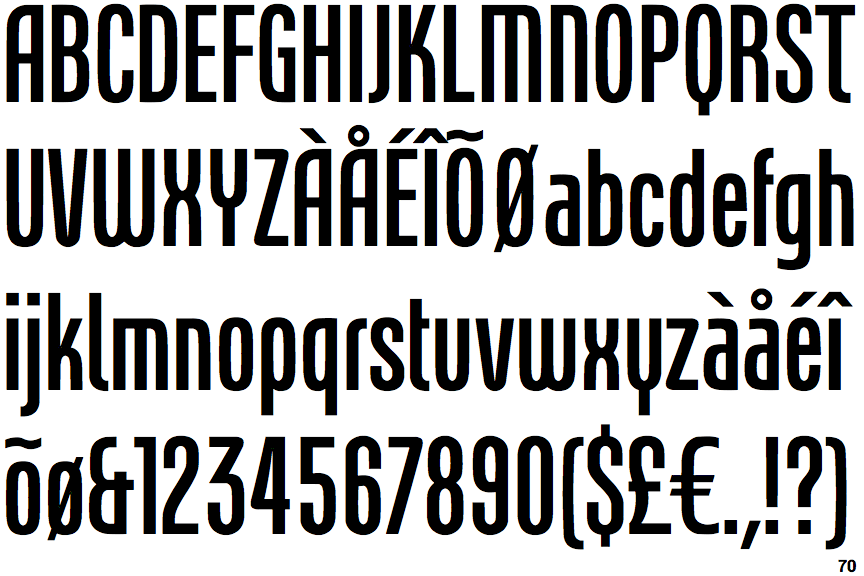
The '&' (ampersand) looks like 'Et' with one enclosed loop (with or without exit stroke).
|
 |
The '4' is closed.
|
 |
The centre vertex of the upper-case 'M' is on the baseline.
|
|
The verticals of the upper-case 'M' are parallel.
|
 |
The top storey of the '3' is a sharp angle.
|
 |
The leg of the upper-case 'R' is curved outwards.
|
 |
The upper-case 'A' has parallel verticals.
|
 |
The right side of the upper-case 'G' has a flat section.
|
 |
The centre strokes of the upper-case 'W' form one centre stroke.
|
Note that the fonts in the icons shown above represent general examples, not necessarily the two fonts chosen for comparison.
Show Examples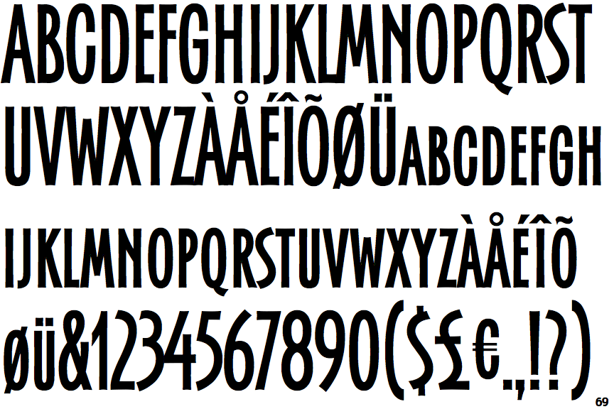
 |
The '&' (ampersand) is traditional style with two enclosed loops.
|
 |
The '4' is open.
|
 |
The centre vertex of the upper-case 'M' is above the baseline.
|
 |
The verticals of the upper-case 'M' are sloping.
|
 |
The top storey of the '3' is a smooth curve.
|
 |
The leg of the upper-case 'R' is straight.
|
 |
The upper-case 'A' has tapered verticals.
|
 |
The right side of the upper-case 'G' is curved.
|
 |
The centre strokes of the upper-case 'W' meet at a vertex.
|