 |
The upper-case 'Q' tail crosses the circle.
|
 |
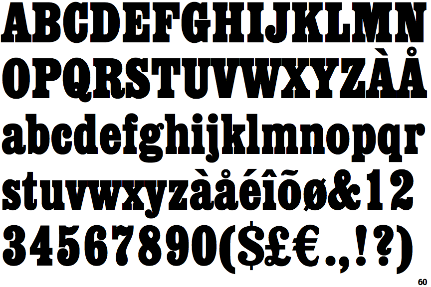
The '$' (dollar) has a single line which does not cross the 'S'.
|
 |
The '&' (ampersand) is traditional style with two enclosed loops.
|
 |
The upper-case 'J' sits on the baseline.
|
 |
The '4' is closed.
|
 |
The diagonal strokes of the upper-case 'K' meet in a 'T'.
|
 |
The upper-case 'G' foot has a downward pointing spur.
|
 |
The tail of the upper-case 'J' has a rounded end or ball.
|
 |
The character outlines are smooth/sharp.
|
 |
The foot of the '£' (pound) has a loop.
|
Note that the fonts in the icons shown above represent general examples, not necessarily the two fonts chosen for comparison.
Show Examples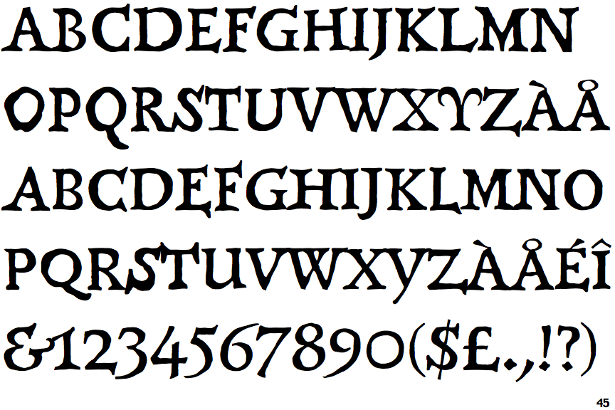
 |
The upper-case 'Q' tail touches the circle.
|
 |
The '$' (dollar) has a single line crossing the 'S'.
|
 |
The '&' (ampersand) looks like 'Et' with a gap at the top.
|
 |
The upper-case 'J' descends below the baseline.
|
 |
The '4' is open.
|
 |
The diagonal strokes of the upper-case 'K' meet at the vertical (with or without a gap).
|
 |
The upper-case 'G' foot has a forward pointing spur or serif.
|
 |
The tail of the upper-case 'J' has a tapered end.
|
 |
The character outlines are corroded, roughened, or dirty.
|
 |
The foot of the '£' (pound) has no loop.
|