Differences
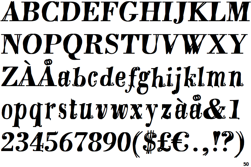
Linotype Down Town
 |
The upper-case 'Q' tail crosses the circle.
|
 |
The '$' (dollar) has a single line crossing the 'S'.
|
 |
The upper-case 'J' sits on the baseline.
|
 |
The '4' is open.
|
 |
The top storey of the '3' is a sharp angle.
|
 |
The centre bar of the upper-case 'P' leaves a gap with the vertical.
|
 |
The upper-case 'U' has a stem/serif.
|
 |
The upper-case 'Y' right-hand arm forms a continuous stroke with the tail.
|
 |
The centre bar of the upper-case 'E' has no serifs.
|
 |
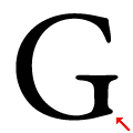
The upper-case 'G' foot has a forward pointing spur or serif.
|
There are more than ten differences; only the first ten are shown.
Note that the fonts in the icons shown above represent general examples, not necessarily the two fonts chosen for comparison.
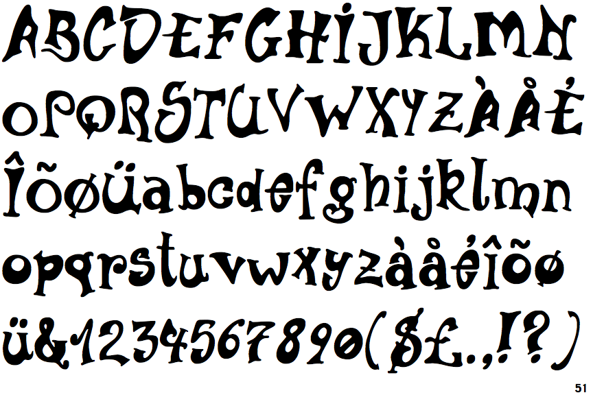
Show ExamplesFF Double Dutch Smooth
 |
The upper-case 'Q' tail touches the circle.
|
 |
The '$' (dollar) has a double line crossing the 'S'.
|
 |
The upper-case 'J' descends below the baseline.
|
 |
The '4' is closed.
|
 |
The top storey of the '3' is a smooth curve.
|
 |
The centre bar of the upper-case 'P' meets the vertical.
|
 |
The upper-case 'U' has no stem/serif.
|
 |
The upper-case 'Y' arms and tail are separate strokes.
|
 |
The centre bar of the upper-case 'E' has serifs.
|
 |
The upper-case 'G' foot has no spur or serif.
|

