 |
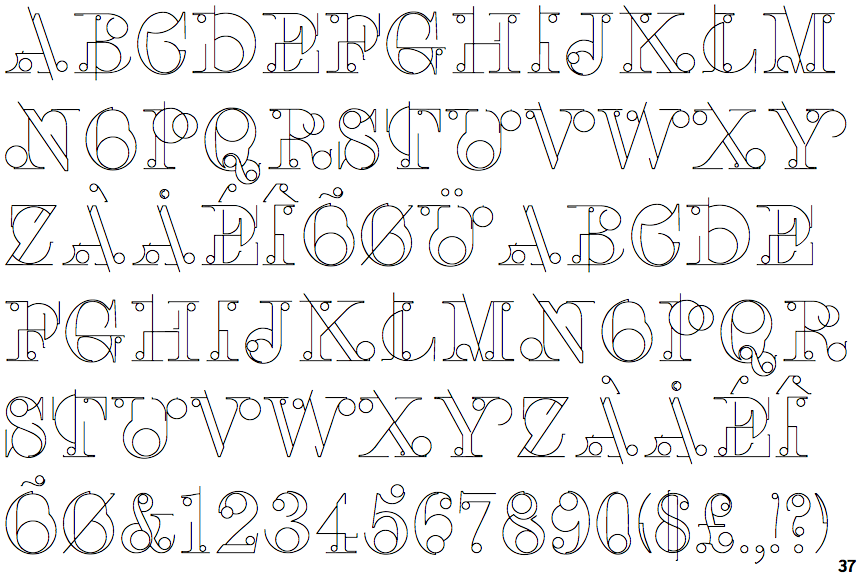
The '$' (dollar) has a double line crossing the 'S'.
|
 |
The characters have serifs.
|
 |
The '4' is closed.
|
 |
The centre vertex of the upper-case 'M' is on the baseline.
|
 |
The characters are outlined, shaded, or filled with a pattern.
|
 |
The tail of the upper-case 'Q' is curved or S-shaped.
|
Note that the fonts in the icons shown above represent general examples, not necessarily the two fonts chosen for comparison.
Show Examples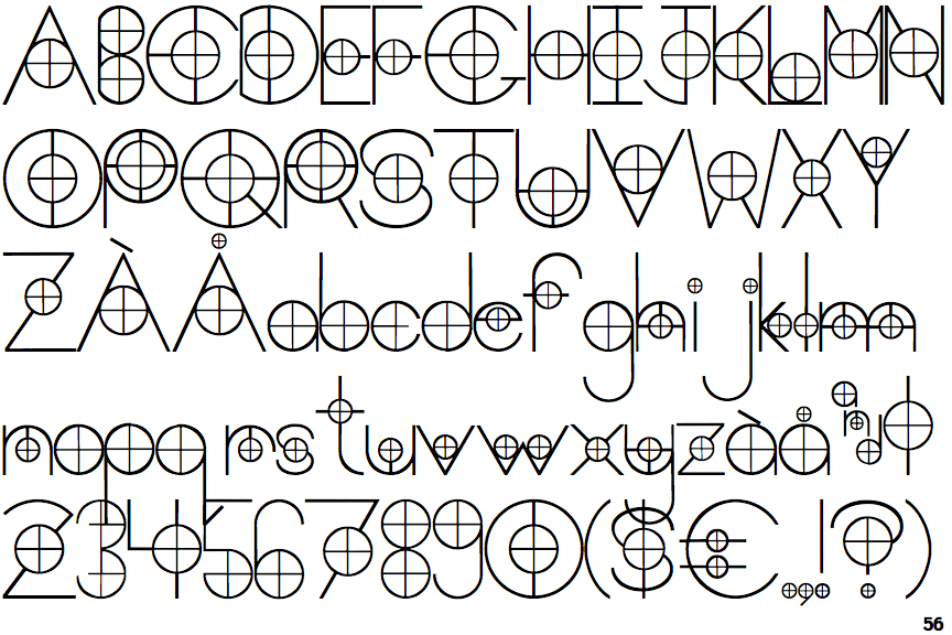
 |
The '$' (dollar) has a single line crossing the 'S'.
|
 |
The characters do not have serifs.
|
 |
The '4' is open.
|
 |
The centre vertex of the upper-case 'M' is above the baseline.
|
 |
The characters are solid.
|
 |
The tail of the upper-case 'Q' is straight.
|