 |
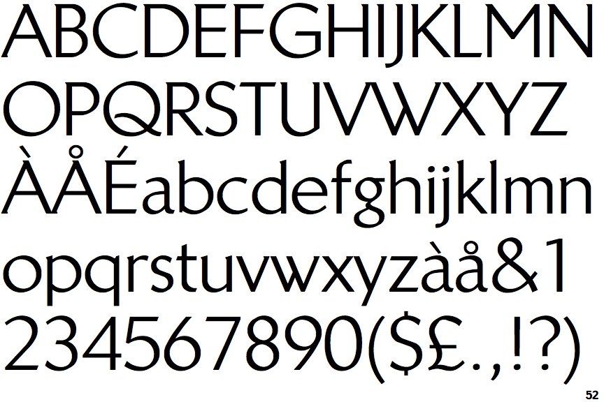
The upper-case 'Q' tail crosses the circle.
|
 |
The '$' (dollar) has a single line which does not cross the 'S'.
|
 |
The '&' (ampersand) is traditional style with two enclosed loops.
|
 |
The centre vertex of the upper-case 'M' is above the baseline.
|
 |
The dot on the '?' (question-mark) is circular or oval.
|
 |
The leg of the upper-case 'R' is straight.
|
 |
The lower-case 'e' has a straight horizontal bar.
|
 |
The centre strokes of the upper-case 'W' meet in a T on the left.
|
Note that the fonts in the icons shown above represent general examples, not necessarily the two fonts chosen for comparison.
Show Examples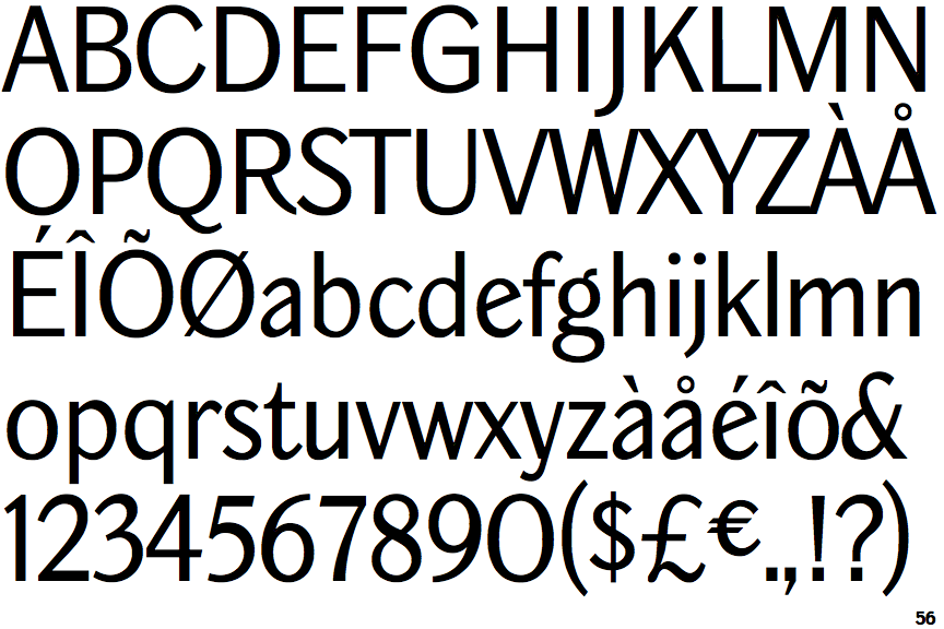
 |
The upper-case 'Q' tail touches the circle.
|
 |
The '$' (dollar) has a single line crossing the 'S'.
|
 |
The '&' (ampersand) is traditional style with a gap at the top.
|
 |
The centre vertex of the upper-case 'M' is on the baseline.
|
 |
The dot on the '?' (question-mark) is square or rectangular.
|
 |
The leg of the upper-case 'R' is curved inwards.
|
 |
The lower-case 'e' has a straight angled bar.
|
 |
The centre strokes of the upper-case 'W' meet at a vertex.
|