 |
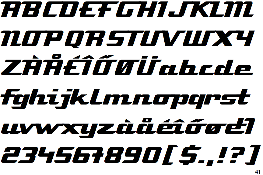
The upper-case 'Q' tail touches the circle.
|
 |
The '$' (dollar) has a single line which does not cross the 'S'.
|
 |
The upper-case 'J' sits on the baseline.
|
 |
The dot on the '?' (question-mark) is square or rectangular.
|
 |
The top storey of the '3' is a smooth curve.
|
 |
The upper-case 'G' has no spur/tail.
|
 |
The top of the upper-case 'A' has a serif or cusp on the left.
|
 |
The upper-case 'G' foot has no spur or serif.
|
 |
The upper-case 'A' has parallel verticals.
|
 |
The upper-case 'E' is normal letter shape.
|
There are more than ten differences; only the first ten are shown.
Note that the fonts in the icons shown above represent general examples, not necessarily the two fonts chosen for comparison.
Show Examples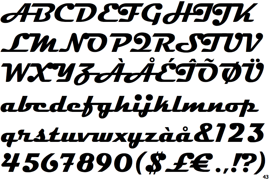
 |
The upper-case 'Q' tail forms part of the stroke of an open circle.
|
 |
The '$' (dollar) has a double line crossing the 'S'.
|
 |
The upper-case 'J' descends below the baseline.
|
 |
The dot on the '?' (question-mark) is circular or oval.
|
 |
The top storey of the '3' is a sharp angle.
|
 |
The upper-case 'G' has a spur/tail.
|
 |
The top of the upper-case 'A' has no serifs or cusps.
|
 |
The upper-case 'G' foot has a downward pointing spur.
|
 |
The upper-case 'A' has tapered verticals.
|
 |
The upper-case 'E' is drawn as a single stroke (with or without loop).
|