 |
The upper-case 'Q' tail crosses the circle.
|
 |
The '$' (dollar) has a double line crossing the 'S'.
|
 |
The lower-case 't' has double-sided bar which forms a right-angle with the vertical.
|
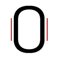 |
The verticals of the digit '0' have straight segments.
|
 |
The strokes of the upper-case 'W' are like three vertical bars '|||'.
|
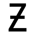 |
The upper-case 'Z' has a single bar.
|
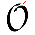 |
The upper-case letter 'O' has a discontinuity or gap.
|
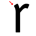 |
The lower-case 'r' has a slanted spur.
|
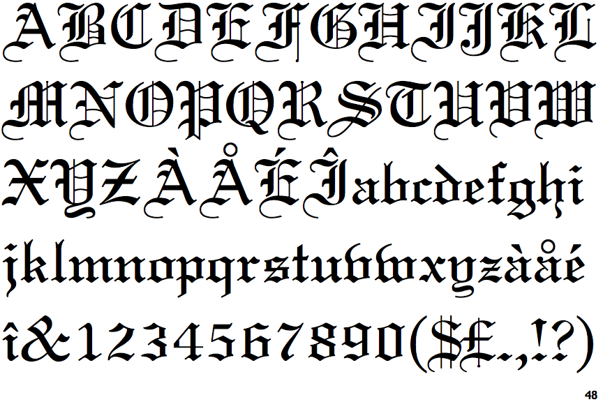
Note that the fonts in the icons shown above represent general examples, not necessarily the two fonts chosen for comparison.
Show Examples
 |
The upper-case 'Q' tail touches the circle.
|
 |
The '$' (dollar) has a single line crossing the 'S'.
|
 |
The lower-case 't' has double-sided bar which forms a diagonal with the vertical.
|
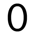 |
The verticals of the digit '0' are fully curved.
|
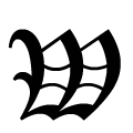 |
The strokes of the upper-case 'W' are like three closing-brackets ')))'.
|
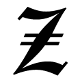 |
The upper-case 'Z' has double bar.
|
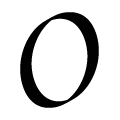 |
The upper-case letter 'O' has a smooth outline with no discontinuity or gap.
|
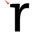 |
The lower-case 'r' has a horizontal serif.
|