Identifont

Fonts by Appearance

Fonts by Name

Fonts by Similarity

Fonts by Picture

Fonts by Designer/Publisher

Differences

TweetTweet Differences

Compare: and  

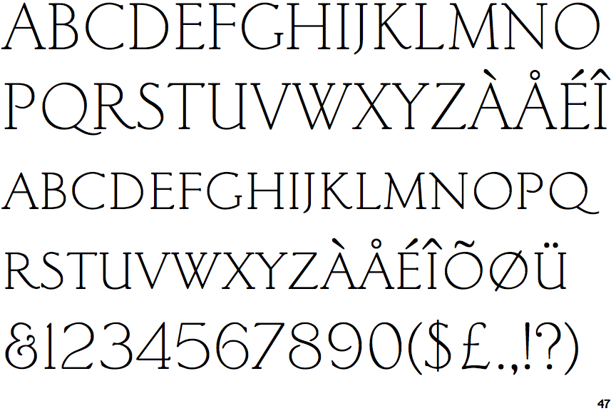
Light Classic Roman

Light Classic Roman

Double
The diagonal strokes of the upper-case 'K' meet in a 'T'.
Round
The top storey of the '3' is a smooth curve.
Four
The top of the upper-case 'W' has four upper terminals.
Double
The foot of the '4' has double-sided serifs.

Note that the fonts in the icons shown above represent general examples, not necessarily the two fonts chosen for comparison.

Show Examples
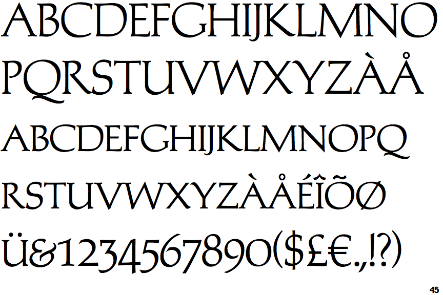
Michelangelo

Michelangelo

Single
The diagonal strokes of the upper-case 'K' meet at the vertical (with or without a gap).
Angled
The top storey of the '3' is a sharp angle.
Three
The top of the upper-case 'W' has three upper terminals.
None
The foot of the '4' has no serifs.