Identifont

Fonts by Appearance

Fonts by Name

Fonts by Similarity

Fonts by Picture

Fonts by Designer/Publisher

Differences

TweetTweet Differences

Compare: and  

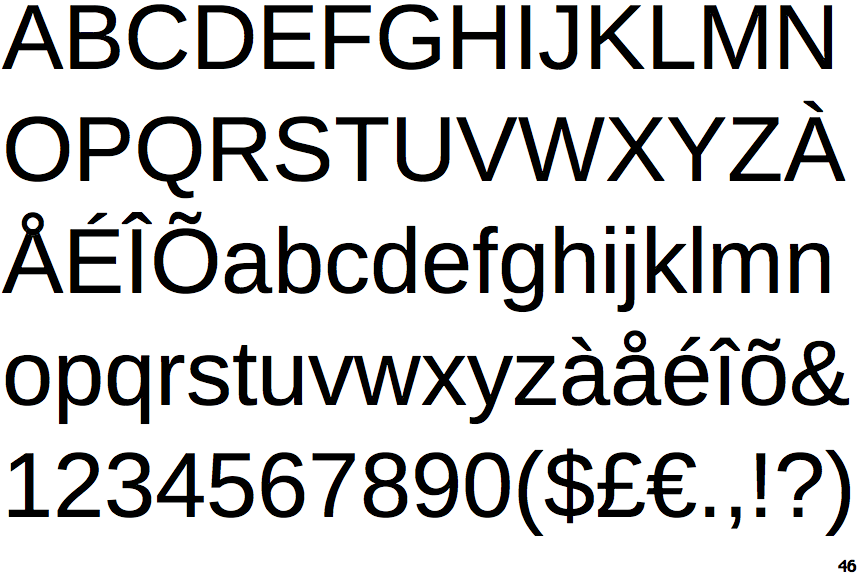
Liberation Sans

Liberation Sans

Baseline
The centre vertex of the upper-case 'M' is on the baseline.
Left
The tail of the lower-case 'y' is curved or U-shaped to the left.
Plain
The upper-case letter 'I' is plain.
Curved-Plain
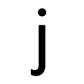
The tail of the lower-case 'j' is curved with no upper serif.

Note that the fonts in the icons shown above represent general examples, not necessarily the two fonts chosen for comparison.

Show Examples
Tahoma

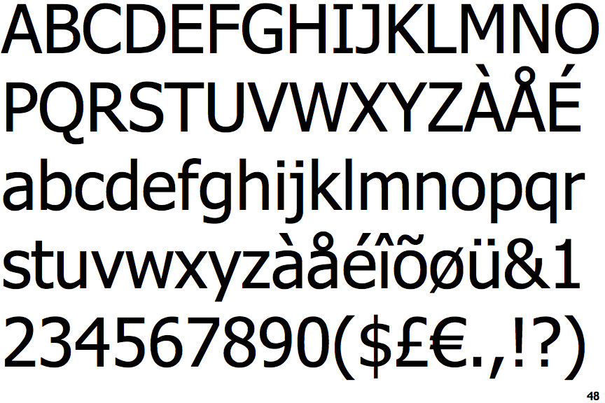
Tahoma

Above
The centre vertex of the upper-case 'M' is above the baseline.
Straight
The tail of the lower-case 'y' is substantially straight.
Serifs
The upper-case letter 'I' has serifs/bars.
Curved-Serif
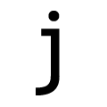
The tail of the lower-case 'j' is curved with an upper serif.