 |
The top stroke of the upper-case 'C' has no upward-pointing serif.
|
 |
The foot of the '4' has no serifs.
|
 |
The tail of the upper-case 'J' has a tapered end.
|
 |
The centre vertex of the upper-case 'W' has two separate serifs.
|
 |
The upper-case 'C' is symmetrical about a horizontal axis.
|
Note that the fonts in the icons shown above represent general examples, not necessarily the two fonts chosen for comparison.
Show Examples
 |
The top stroke of the upper-case 'C' has a vertical or angled upward-pointing serif.
|
 |
The foot of the '4' has double-sided serifs.
|
 |
The tail of the upper-case 'J' has a rounded end or ball.
|
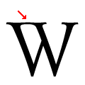 |
The centre vertex of the upper-case 'W' has centre serifs joined to the left serif.
|
 |
The upper-case 'C' is asymmetrical about a horizontal axis.
|