 |
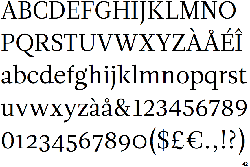
The diagonal strokes of the upper-case 'K' connect to the vertical via a horizontal bar.
|
 |
The tail of the upper-case 'J' has a tapered end.
|
 |
The bar of the lower-case 'f' is double-sided.
|
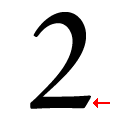 |
The base of the '2' has no serif.
|
Note that the fonts in the icons shown above represent general examples, not necessarily the two fonts chosen for comparison.
Show Examples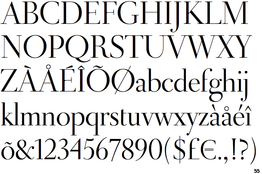
 |
The diagonal strokes of the upper-case 'K' meet in a 'T'.
|
 |
The tail of the upper-case 'J' has a rounded end or ball.
|
 |
The bar of the lower-case 'f' is single-sided.
|
 |
The base of the '2' has an upward-pointing serif.
|