Identifont

Fonts by Appearance

Fonts by Name

Fonts by Similarity

Fonts by Picture

Fonts by Designer/Publisher

Differences

TweetTweet Differences

Compare: and  

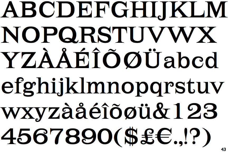
Lehmann

Lehmann

Closed
The '&' (ampersand) is traditional style with two enclosed loops.
Below
The upper-case 'J' descends below the baseline.
Closed
The '4' is closed.
No-Spur
The upper-case 'G' foot has no spur or serif.
No gap
The lower storey of the lower-case 'g' has no gap.
Asymmetrical
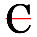
The upper-case 'C' is asymmetrical about a horizontal axis.

Note that the fonts in the icons shown above represent general examples, not necessarily the two fonts chosen for comparison.

Show Examples
Trivia Serif

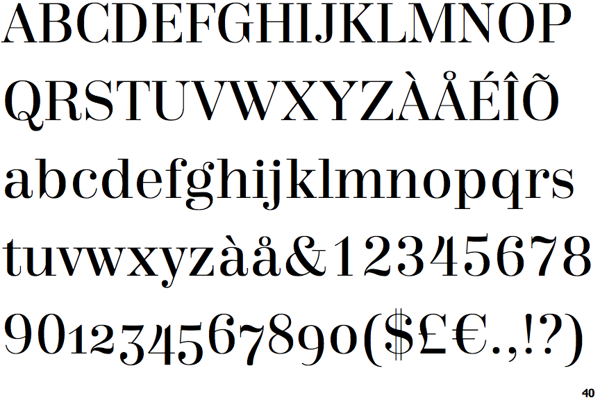
Trivia Serif

Open
The '&' (ampersand) is traditional style with a gap at the top.
On
The upper-case 'J' sits on the baseline.
Open
The '4' is open.
Spur
The upper-case 'G' foot has a downward pointing spur.
Gap
The lower storey of the lower-case 'g' has a gap.
Symmetrical
The upper-case 'C' is symmetrical about a horizontal axis.