 |
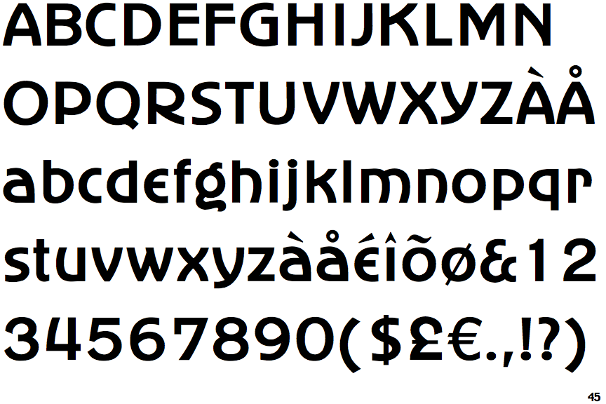
The upper-case 'Q' tail touches the circle.
|
 |
The '&' (ampersand) looks like 'Et' with a gap at the top.
|
 |
The upper-case 'J' sits on the baseline.
|
 |
The characters do not have serifs.
|
 |
The diagonal strokes of the upper-case 'K' meet in a 'T'.
|
 |
The verticals of the upper-case 'M' are parallel.
|
 |
The upper-case 'Y' right-hand arm forms a continuous stroke with the tail.
|
 |
The character outlines are smooth/sharp.
|
 |
The tail of the lower-case 'f' sits on the baseline.
|
Note that the fonts in the icons shown above represent general examples, not necessarily the two fonts chosen for comparison.
Show Examples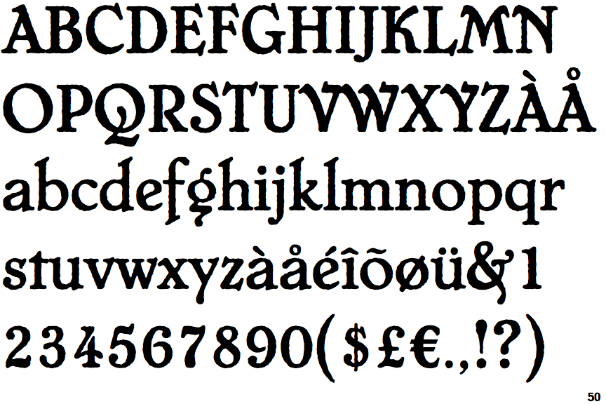
 |
The upper-case 'Q' tail crosses the circle.
|
 |
The '&' (ampersand) is traditional style with two enclosed loops.
|
 |
The upper-case 'J' descends below the baseline.
|
 |
The characters have serifs.
|
 |
The diagonal strokes of the upper-case 'K' meet at the vertical (with or without a gap).
|
 |
The verticals of the upper-case 'M' are sloping.
|
 |
The upper-case 'Y' arms and tail are separate strokes.
|
 |
The character outlines are corroded, roughened, or dirty.
|
 |
The tail of the lower-case 'f' descends below the baseline.
|