 |
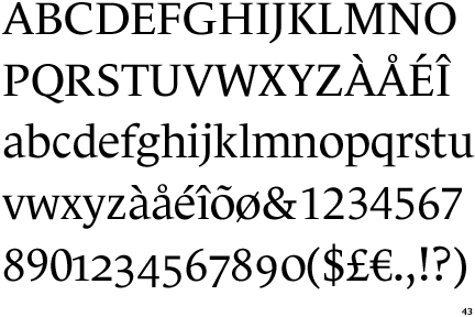
The centre bar of the upper-case 'P' leaves a gap with the vertical.
|
 |
The top of the upper-case 'A' has no serifs or cusps.
|
 |
The centre bar of the upper-case 'E' has serifs.
|
 |
The centre bar of the upper-case 'R' leaves a gap with the vertical.
|
 |
The bar of the upper-case 'G' is double-sided.
|
 |
The lower storey of the lower-case 'g' has no gap.
|
 |
The centre bar of the upper-case 'F' has serifs.
|
 |
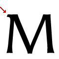
The top vertices of the upper-case 'M' have symmetrical single-sided serifs.
|
Note that the fonts in the icons shown above represent general examples, not necessarily the two fonts chosen for comparison.
Show Examples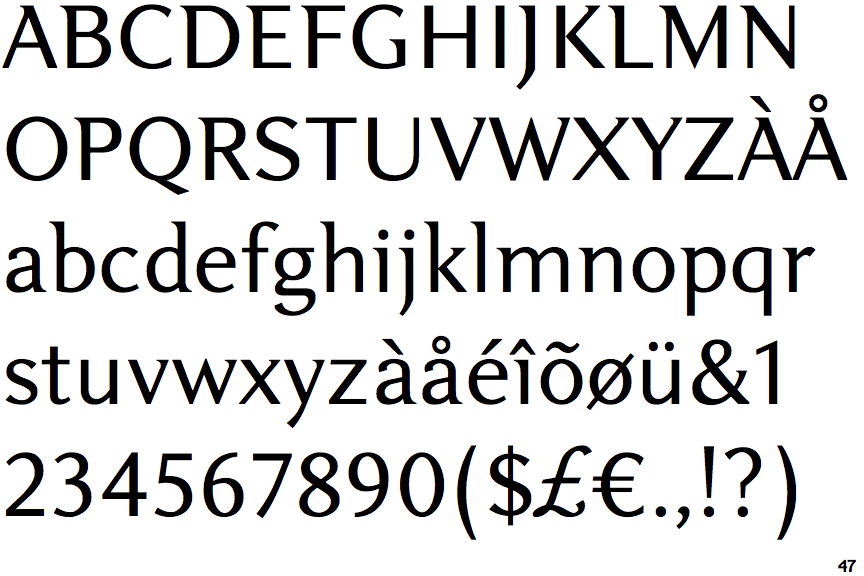
 |
The centre bar of the upper-case 'P' meets the vertical.
|
 |
The top of the upper-case 'A' has a serif or cusp on the left.
|
 |
The centre bar of the upper-case 'E' has no serifs.
|
 |
The centre bar of the upper-case 'R' meets the vertical.
|
 |
The bar of the upper-case 'G' is single-sided, left-facing.
|
 |
The lower storey of the lower-case 'g' has a gap.
|
 |
The centre bar of the upper-case 'F' has no serifs.
|
 |
The top vertices of the upper-case 'M' have a single left-pointing serif.
|