 |
The upper-case 'J' sits on the baseline.
|
 |
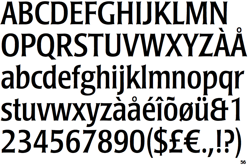
The characters do not have serifs.
|
 |
The diagonal strokes of the upper-case 'K' meet in a 'T'.
|
 |
The dot on the '?' (question-mark) is circular or oval.
|
 |
The centre bar of the upper-case 'P' meets the vertical.
|
 |
The upper-case 'U' has no stem/serif.
|
 |
The dot on the lower-case 'i' or 'j' is circular or oval.
|
 |
The tail of the upper-case 'Q' is straight (horizontal, diagonal, or vertical).
|
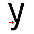 |
There is a break at the junction of the lower-case 'y'.
|
 |
The foot of the '£' (pound) has no loop.
|
Note that the fonts in the icons shown above represent general examples, not necessarily the two fonts chosen for comparison.
Show Examples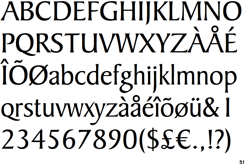
 |
The upper-case 'J' descends below the baseline.
|
 |
The characters have serifs.
|
 |
The diagonal strokes of the upper-case 'K' meet at the vertical (with or without a gap).
|
 |
The dot on the '?' (question-mark) is diamond-shaped or triangular.
|
 |
The centre bar of the upper-case 'P' leaves a gap with the vertical.
|
 |
The upper-case 'U' has a stem/serif.
|
 |
The dot on the lower-case 'i' or 'j' is diamond-shaped.
|
 |
The tail of the upper-case 'Q' is curved, S-shaped, or Z-shaped.
|
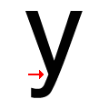 |
There is a smooth join at the junction of the lower-case 'y'.
|
 |
The foot of the '£' (pound) has a loop.
|