Identifont

Fonts by Appearance

Fonts by Name

Fonts by Similarity

Fonts by Picture

Fonts by Designer/Publisher

Differences

TweetTweet Differences

Compare: and  

Latin 725

Latin 725

Et shaped
The '&' (ampersand) looks like 'Et' with one enclosed loop (with or without exit stroke).
Round
The top storey of the '3' is a smooth curve.
Two
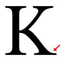
The leg of the upper-case 'K' has two serifs.
Gap
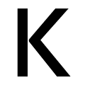
The junction of the upper-case 'K' leaves a visible gap with the vertical.

Note that the fonts in the icons shown above represent general examples, not necessarily the two fonts chosen for comparison.

Show Examples
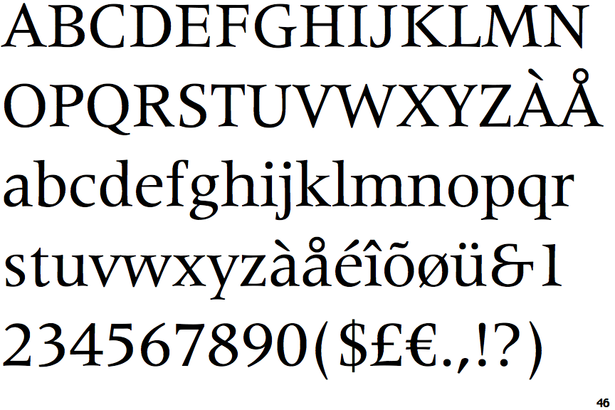
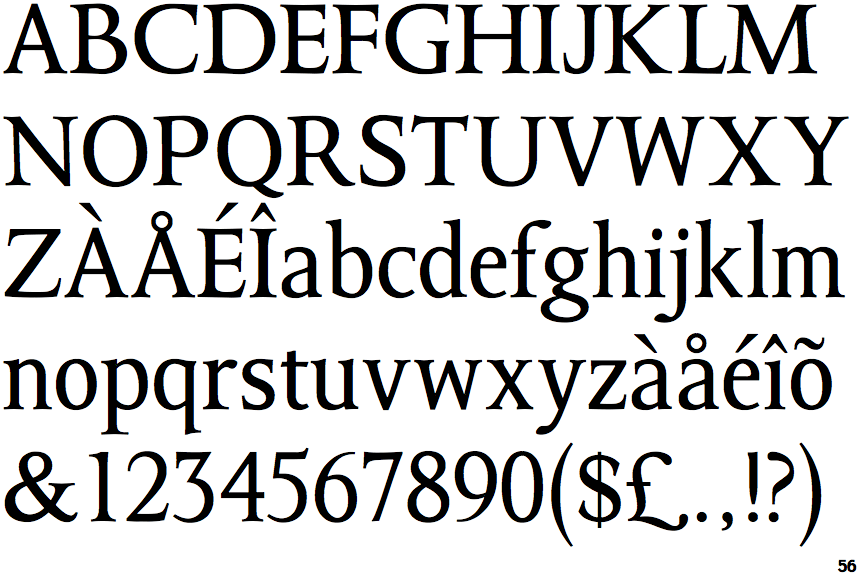
Octavian

Octavian

Closed
The '&' (ampersand) is traditional style with two enclosed loops.
Angled
The top storey of the '3' is a sharp angle.
One
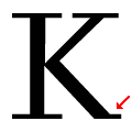
The leg of the upper-case 'K' has a single right-pointing serif or foot.
Meets
The junction of the upper-case 'K' touches the vertical.