Identifont

Fonts by Appearance

Fonts by Name

Fonts by Similarity

Fonts by Picture

Fonts by Designer/Publisher

Differences

TweetTweet Differences

Compare: and  

Laser

Laser

Gap top
The '&' (ampersand) looks like 'Et' with a gap at the top.
Above
The centre vertex of the upper-case 'M' is above the baseline.
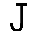
Double-bar
The upper-case 'J' has a bar both sides.
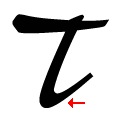
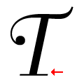
Right
The tail of the upper-case 'T' curves to the right.
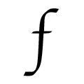
None
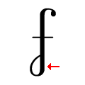
The stroke of the lower-case 'f' has no loops.

Note that the fonts in the icons shown above represent general examples, not necessarily the two fonts chosen for comparison.

Show Examples
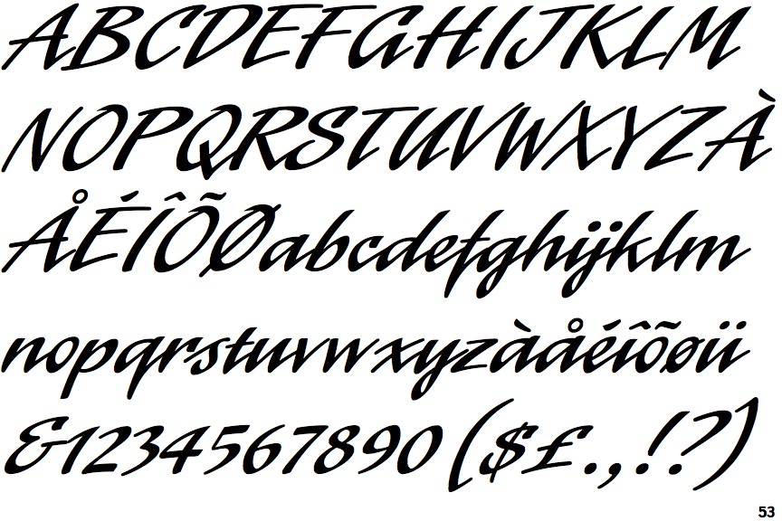
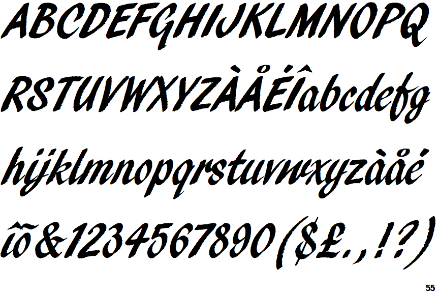
Pendry Script

Pendry Script

Closed
The '&' (ampersand) is traditional style with two enclosed loops.
Baseline
The centre vertex of the upper-case 'M' is on the baseline.
Plain
The upper-case 'J' has no bar.
Straight
The tail of the upper-case 'T' is straight.
Lower
The stroke of the lower-case 'f' has a lower loop only.