Identifont

Fonts by Appearance

Fonts by Name

Fonts by Similarity

Fonts by Picture

Fonts by Designer/Publisher

Differences

TweetTweet Differences

Compare: and  

Lab Grotesque Black

Lab Grotesque Black

Crosses
The upper-case 'Q' tail crosses the circle.
Open
The '4' is open.
Double
The diagonal strokes of the upper-case 'K' meet in a 'T'.
Angled
The top storey of the '3' is a sharp angle.
Spur
The upper-case 'G' has a spur/tail.
Straight
The leg of the upper-case 'R' is straight.

Note that the fonts in the icons shown above represent general examples, not necessarily the two fonts chosen for comparison.

Show Examples
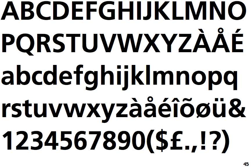
Frutiger Bold

Frutiger Bold

Touches
The upper-case 'Q' tail touches the circle.
Closed
The '4' is closed.
Single
The diagonal strokes of the upper-case 'K' meet at the vertical (with or without a gap).
Round
The top storey of the '3' is a smooth curve.
No spur
The upper-case 'G' has no spur/tail.
Outwards
The leg of the upper-case 'R' is curved outwards.