 |
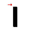
The upper-case 'J' descends below the baseline.
|
 |
The diagonal strokes of the upper-case 'K' meet at the vertical (with or without a gap).
|
 |
The verticals of the upper-case 'M' are sloping.
|
 |
The upper-case 'G' has a bar to the left.
|
 |
The upper-case 'E' is normal letter shape.
|
 |
The sides of the lower-case 'y' are angled (V-shaped).
|
 |
The dot on the lower-case 'i' or 'j' is circular or oval.
|
 |
The bar of the lower-case 'f' is double-sided.
|
 |
The tail of the upper-case 'Q' is slanted.
|
 |
The centre strokes of the upper-case 'W' meet at a vertex.
|
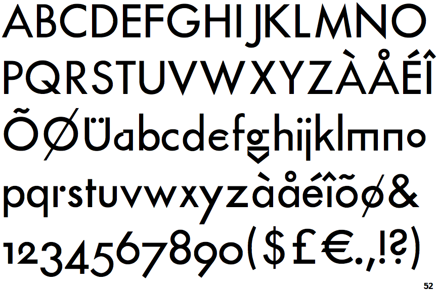
Note that the fonts in the icons shown above represent general examples, not necessarily the two fonts chosen for comparison.
Show Examples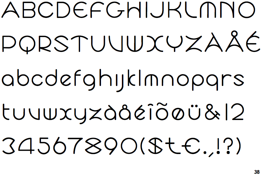
 |
The upper-case 'J' sits on the baseline.
|
 |
The diagonal strokes of the upper-case 'K' connect to the vertical via a horizontal bar.
|
 |
The verticals of the upper-case 'M' are parallel.
|
 |
The upper-case 'G' has double-sided bar.
|
 |
The upper-case 'E' is drawn as a 'C' with a bar.
|
 |
The sides of the lower-case 'y' are parallel (U-shaped).
|
 |
The dot on the lower-case 'i' or 'j' is missing.
|
 |
The bar of the lower-case 'f' is single-sided.
|
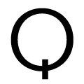 |
The tail of the upper-case 'Q' is vertical.
|
 |
The centre strokes of the upper-case 'W' form one centre stroke.
|