Identifont

Fonts by Appearance

Fonts by Name

Fonts by Similarity

Fonts by Picture

Fonts by Designer/Publisher

Differences

TweetTweet Differences

Compare: and  

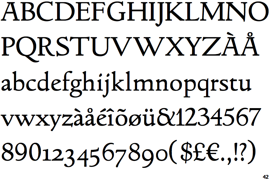
LTC Italian Old Style

LTC Italian Old Style

Open
The '&' (ampersand) is traditional style with a gap at the top.
Double
The diagonal strokes of the upper-case 'K' meet in a 'T'.
Both
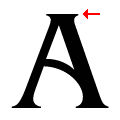
The top of the upper-case 'A' has serifs both sides, or a top bar.
Sloping
The lower-case 'e' has a straight angled bar.

Note that the fonts in the icons shown above represent general examples, not necessarily the two fonts chosen for comparison.

Show Examples
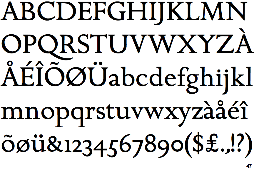
ITC Golden Cockerel

ITC Golden Cockerel

Closed
The '&' (ampersand) is traditional style with two enclosed loops.
Single
The diagonal strokes of the upper-case 'K' meet at the vertical (with or without a gap).
None
The top of the upper-case 'A' has no serifs or cusps.
Horizontal
The lower-case 'e' has a straight horizontal bar.