 |
The diagonal strokes of the upper-case 'K' meet in a 'T'.
|
 |
The lower-case 'g' is double-storey (with or without gap).
|
 |
The tail of the upper-case 'Q' is curved or S-shaped.
|
 |
The lower-case 'e' has a straight angled bar.
|
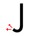 |
The tail of the upper-case 'J' points horizontally or slightly upwards.
|
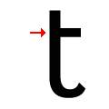 |
The lower-case 't' has a single-sided bar.
|
 |
The centre strokes of the upper-case 'W' meet in a T on the left.
|
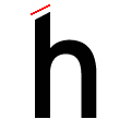 |
The top of the lower-case 'h' ascender is angled upwards.
|
Note that the fonts in the icons shown above represent general examples, not necessarily the two fonts chosen for comparison.
Show Examples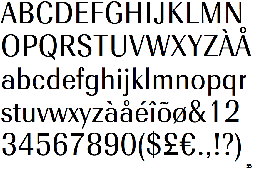
 |
The diagonal strokes of the upper-case 'K' meet at the vertical (with or without a gap).
|
 |
The lower-case 'g' is single-storey (with or without loop).
|
 |
The tail of the upper-case 'Q' is straight.
|
 |
The lower-case 'e' has a straight horizontal bar.
|
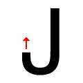 |
The tail of the upper-case 'J' points vertically.
|
 |
The lower-case 't' has double-sided bar which forms a right-angle with the vertical.
|
 |
The centre strokes of the upper-case 'W' meet at a vertex.
|
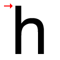 |
The top of the lower-case 'h' ascender is flat.
|