 |
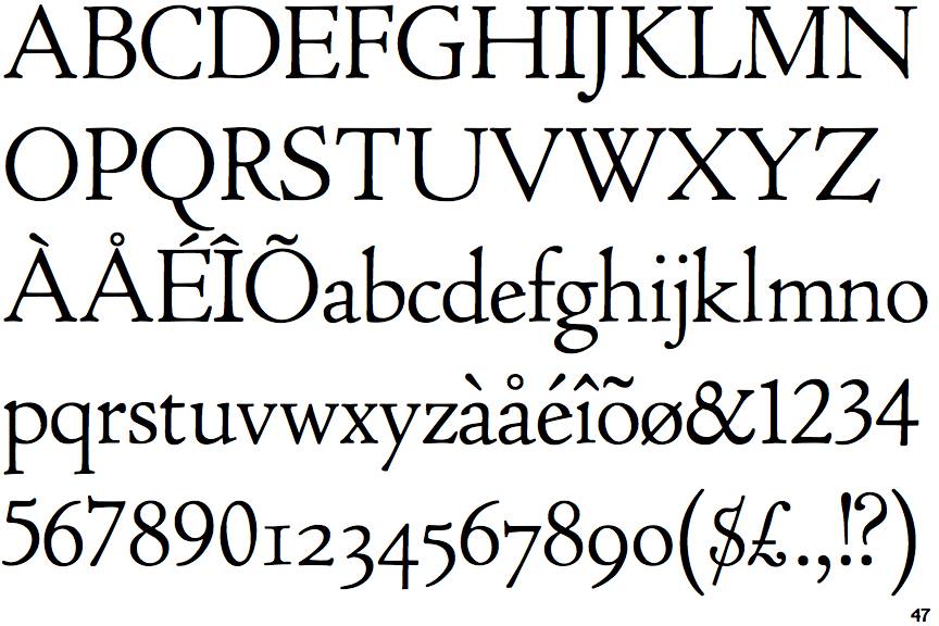
The verticals of the upper-case 'M' are parallel.
|
 |
The top of the upper-case 'W' has four upper terminals.
|
 |
The tail of the upper-case 'J' has a rounded end or ball.
|
 |
The lower-case 'e' has a straight angled bar.
|
 |
The top vertices of the upper-case 'M' have symmetrical double-sided serifs.
|
 |
The foot of the '£' (pound) has no loop.
|
Note that the fonts in the icons shown above represent general examples, not necessarily the two fonts chosen for comparison.
Show Examples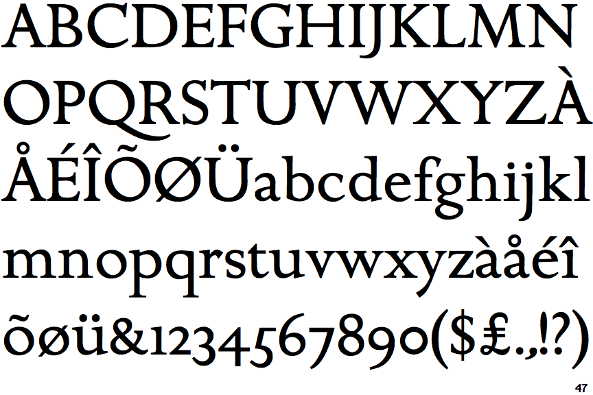
 |
The verticals of the upper-case 'M' are sloping.
|
 |
The top of the upper-case 'W' has three upper terminals.
|
 |
The tail of the upper-case 'J' has a tapered end.
|
 |
The lower-case 'e' has a straight horizontal bar.
|
 |
The top vertices of the upper-case 'M' have symmetrical single-sided serifs.
|
 |
The foot of the '£' (pound) has a loop.
|