Identifont

Fonts by Appearance

Fonts by Name

Fonts by Similarity

Fonts by Picture

Fonts by Designer/Publisher

Differences

TweetTweet Differences

Compare: and  

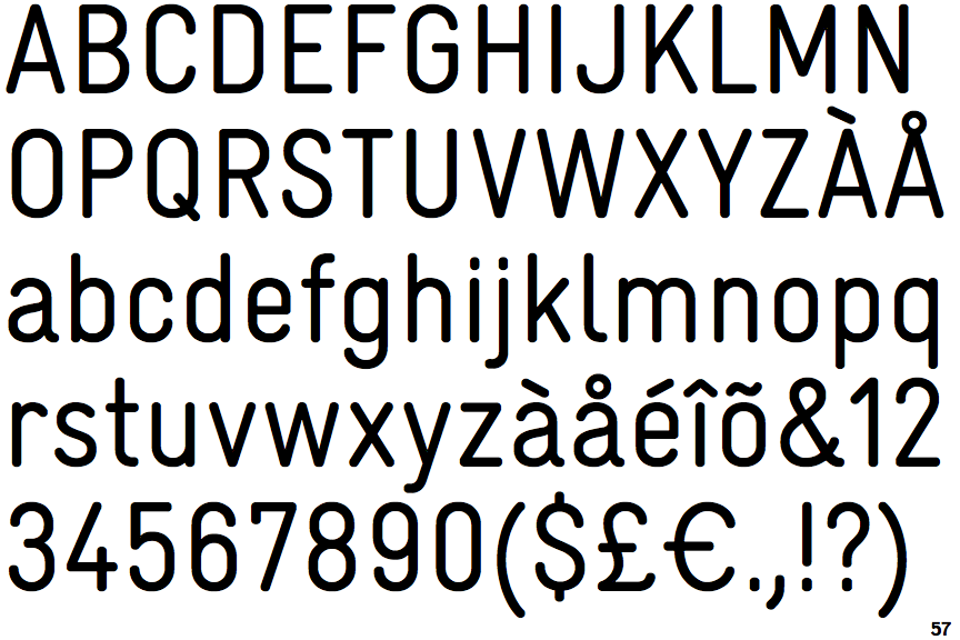
LL Gravur Condensed

LL Gravur Condensed

Open
The '4' is open.
Above
The centre vertex of the upper-case 'M' is above the baseline.
Parallel
The verticals of the upper-case 'M' are parallel.
Round
The top storey of the '3' is a smooth curve.
Right
The 'l' (lower-case 'L') has a right-facing lower serif or tail.
Stem
The lower-case 'u' has a stem/serif.

Note that the fonts in the icons shown above represent general examples, not necessarily the two fonts chosen for comparison.

Show Examples
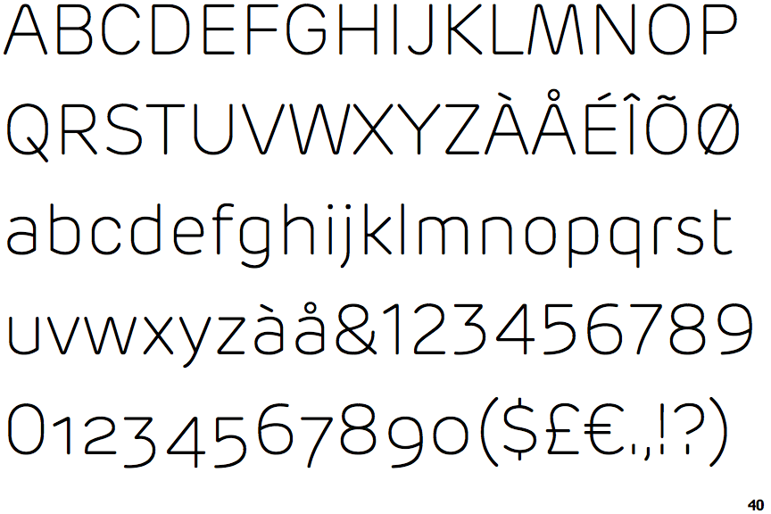
New Rubrik Extra Light

New Rubrik Extra Light

Closed
The '4' is closed.
Baseline
The centre vertex of the upper-case 'M' is on the baseline.
Sloping
The verticals of the upper-case 'M' are sloping.
Angled
The top storey of the '3' is a sharp angle.
Plain
The 'l' (lower-case 'L') has no serifs or tail.
No-Stem
The lower-case 'u' has no stem/serif.