Identifont

Fonts by Appearance

Fonts by Name

Fonts by Similarity

Fonts by Picture

Fonts by Designer/Publisher

Differences

TweetTweet Differences

Compare: and  

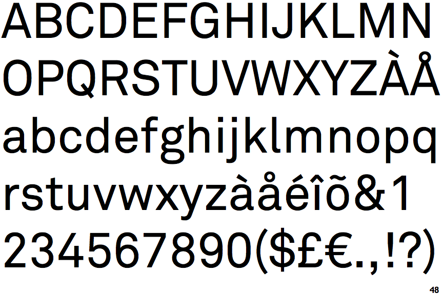
LL Akkurat

LL Akkurat

Crosses
The upper-case 'Q' tail crosses the circle.
Open
The '4' is open.
Right
The 'l' (lower-case 'L') has a right-facing lower serif or tail.
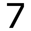
Straight
The stem of the '7' is straight.

Note that the fonts in the icons shown above represent general examples, not necessarily the two fonts chosen for comparison.

Show Examples
Franklin Gothic Compressed (URW)

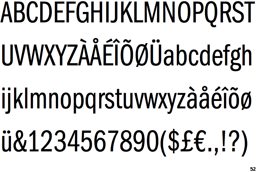
Franklin Gothic Compressed (URW)

Touches
The upper-case 'Q' tail touches the circle.
Closed
The '4' is closed.
Plain
The 'l' (lower-case 'L') has no serifs or tail.
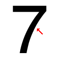
Concave
The stem of the '7' is curved inwards.