 |
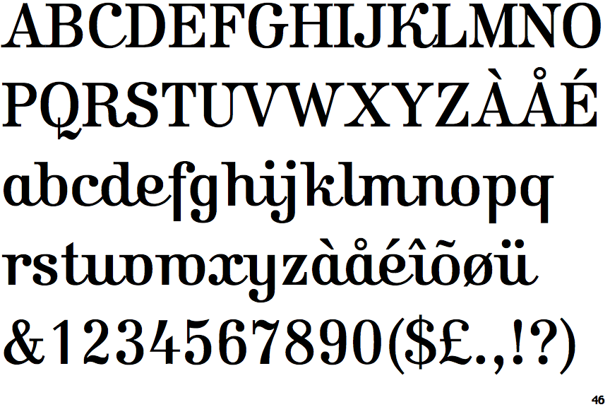
The characters have serifs.
|
 |
The '4' is open.
|
 |
The dot on the '?' (question-mark) is circular or oval.
|
 |
The lower-case 'a' stem stops at the top of the bowl (single storey).
|
 |
The strokes are upright.
|
 |
The sides of the lower-case 'y' are parallel (U-shaped).
|
 |
The dot on the lower-case 'i' or 'j' is circular or oval.
|
 |
The tail of the lower-case 'f' descends below the baseline.
|
Note that the fonts in the icons shown above represent general examples, not necessarily the two fonts chosen for comparison.
Show Examples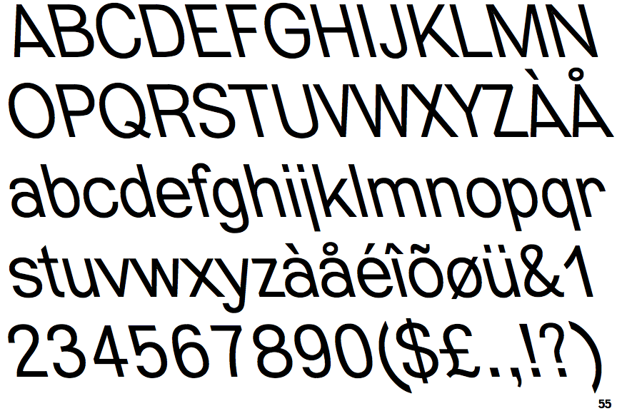
 |
The characters do not have serifs.
|
 |
The '4' is closed.
|
 |
The dot on the '?' (question-mark) is square or rectangular.
|
 |
The lower-case 'a' stem curves over the top of the bowl (double storey).
|
 |
The strokes are sloped left (backslant or linkskursiv).
|
 |
The sides of the lower-case 'y' are angled (V-shaped).
|
 |
The dot on the lower-case 'i' or 'j' is square or rectangular.
|
 |
The tail of the lower-case 'f' sits on the baseline.
|