 |
The upper-case 'Q' tail crosses the circle.
|
 |
The centre bar of the upper-case 'P' leaves a gap with the vertical.
|
 |
The stroke of the 'l' (lower-case 'L') has a loop.
|
 |
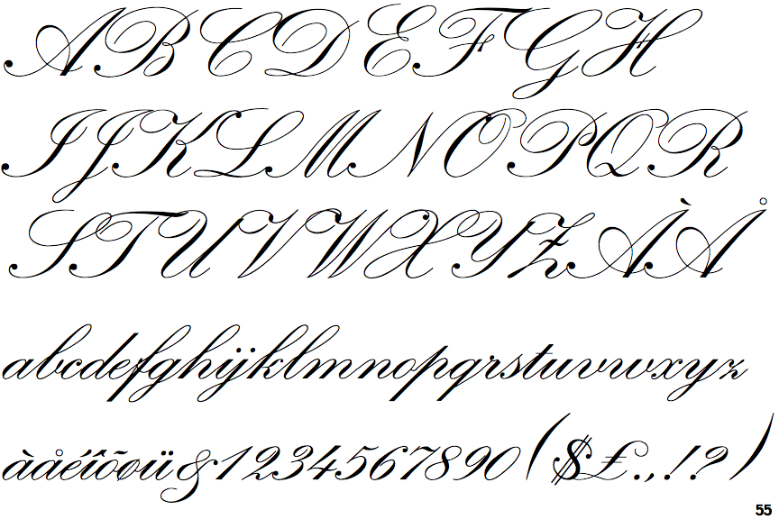
The upper-case 'H' bar is continuous with both verticals.
|
 |
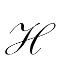
The stroke of the 'b' has a loop.
|
 |
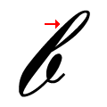
The vertical stroke of the 'k' has a loop.
|
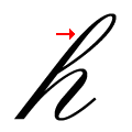 |
The stroke of the lower-case 'h' has a loop.
|
Note that the fonts in the icons shown above represent general examples, not necessarily the two fonts chosen for comparison.
Show Examples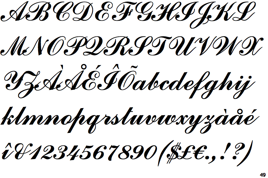
 |
The upper-case 'Q' tail forms part of the stroke of an open circle.
|
 |
The centre bar of the upper-case 'P' crosses the vertical.
|
 |
The stroke of the 'l' (lower-case 'L') has no loop.
|
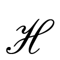 |
The upper-case 'H' bar loops to join the top of the right vertical.
|
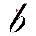 |
The stroke of the 'b' has no loop.
|
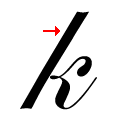 |
The vertical stroke of the 'k' has no loop.
|
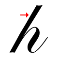 |
The stroke of the lower-case 'h' has no loop.
|