 |
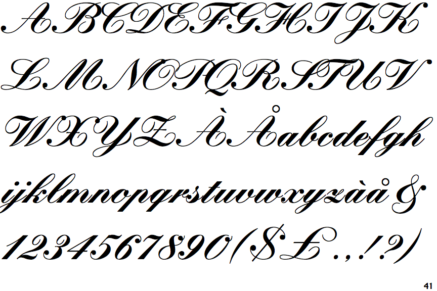
The upper-case 'Q' tail touches the circle.
|
 |
The '&' (ampersand) is traditional style with a gap at the top.
|
 |
The centre bar of the upper-case 'R' meets the vertical.
|
 |
The stroke of the 'l' (lower-case 'L') has a loop.
|
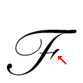 |
The bar of the upper-case 'F' is terminated with a flourish or serif on the right.
|
Note that the fonts in the icons shown above represent general examples, not necessarily the two fonts chosen for comparison.
Show Examples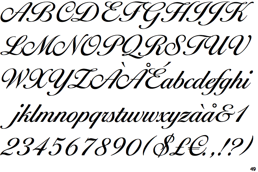
 |
The upper-case 'Q' tail forms part of the stroke of an open circle.
|
 |
The '&' (ampersand) looks like 'Et' with a gap at the top.
|
 |
The centre bar of the upper-case 'R' leaves a gap with the vertical.
|
 |
The stroke of the 'l' (lower-case 'L') has no loop.
|
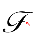 |
The bar of the upper-case 'F' is plain.
|