Identifont

Fonts by Appearance

Fonts by Name

Fonts by Similarity

Fonts by Picture

Fonts by Designer/Publisher

Differences

TweetTweet Differences

Compare: and  

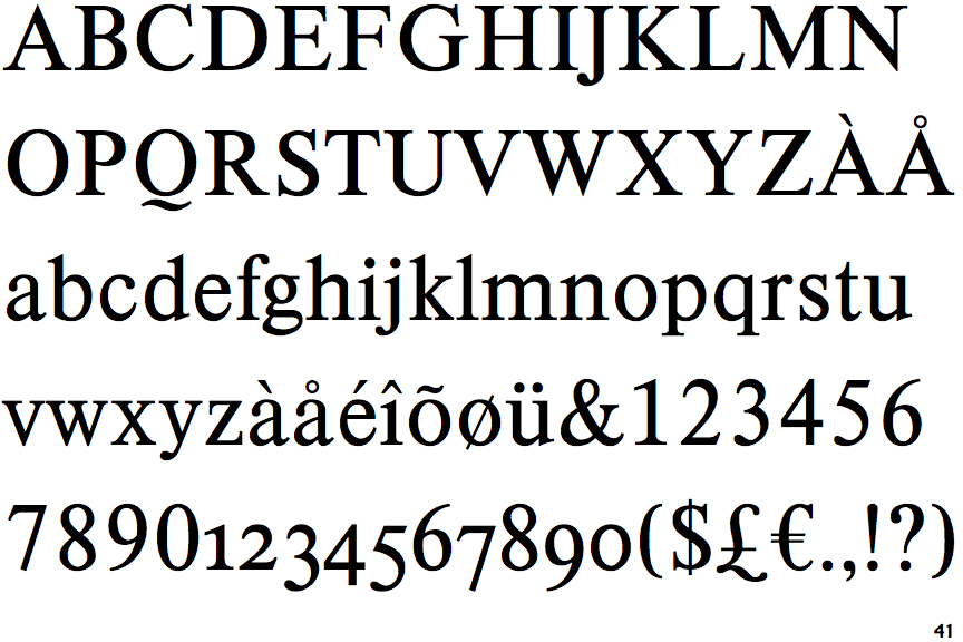
Korpus Serif Pro

Korpus Serif Pro

Below
The upper-case 'Q' tail is below and separated from the circle.
Below
The upper-case 'J' descends below the baseline.

Note that the fonts in the icons shown above represent general examples, not necessarily the two fonts chosen for comparison.

Show Examples
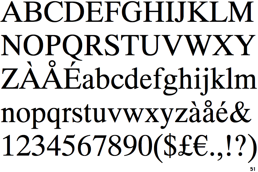
Pelham DT

Pelham DT

Touches
The upper-case 'Q' tail touches the circle.
On
The upper-case 'J' sits on the baseline.