 |
The upper-case 'J' sits on the baseline.
|
 |
The diagonal strokes of the upper-case 'K' meet at the vertical (with or without a gap).
|
 |
The centre bar of the upper-case 'P' leaves a gap with the vertical.
|
 |
The lower-case 'g' is single-storey (with or without loop).
|
 |
The upper-case 'U' has a stem/serif.
|
 |
The lower-case 'a' stem stops at the top of the bowl (single storey).
|
 |
The upper-case 'Y' right-hand arm forms a continuous stroke with the tail.
|
 |
The upper-case 'J' has no bar.
|
 |
The centre bar of the upper-case 'R' leaves a gap with the vertical.
|
 |
The lower-case 'u' has a stem/serif.
|
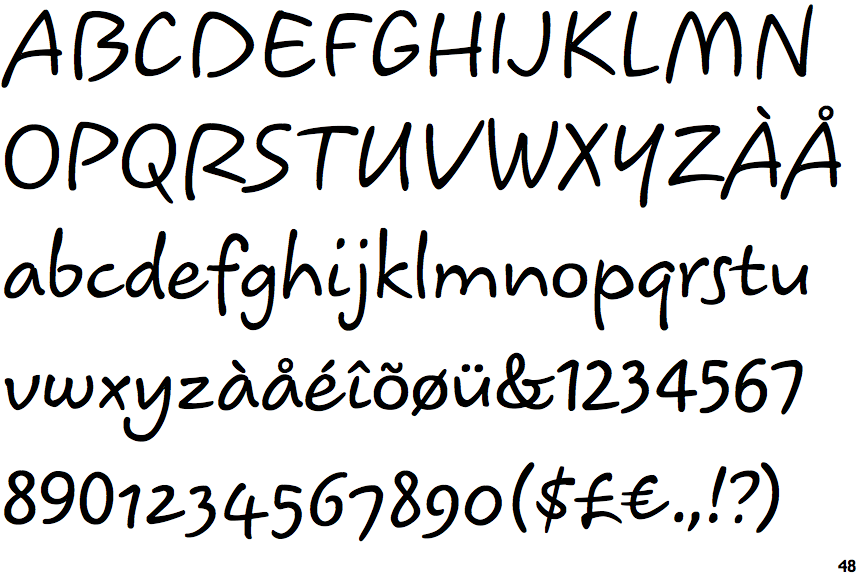
There are more than ten differences; only the first ten are shown.
Note that the fonts in the icons shown above represent general examples, not necessarily the two fonts chosen for comparison.
Show Examples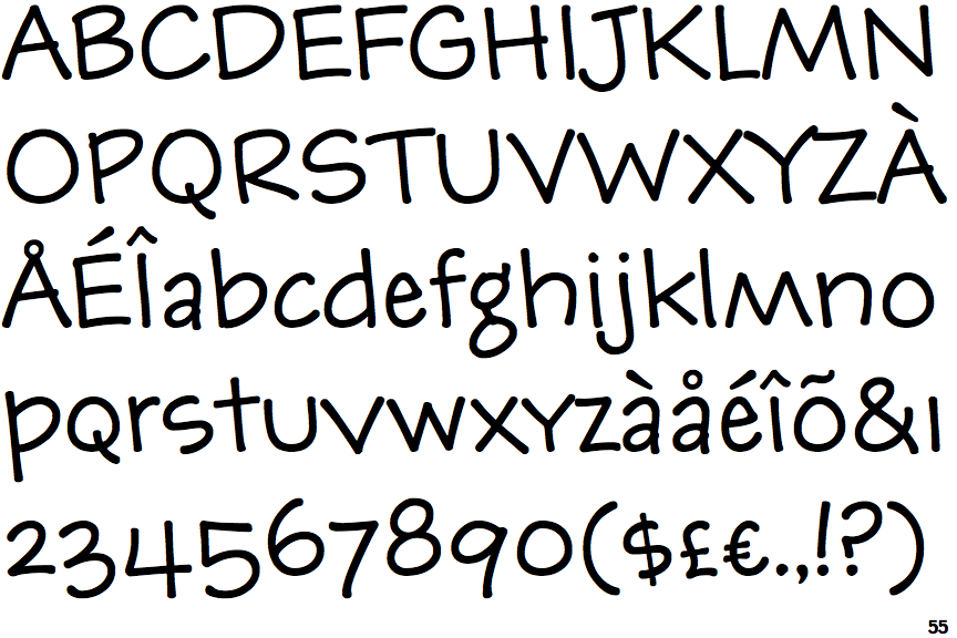
 |
The upper-case 'J' descends below the baseline.
|
 |
The diagonal strokes of the upper-case 'K' meet in a 'T'.
|
 |
The centre bar of the upper-case 'P' meets the vertical.
|
 |
The lower-case 'g' is double-storey (with or without gap).
|
 |
The upper-case 'U' has no stem/serif.
|
 |
The lower-case 'a' stem curves over the top of the bowl (double storey).
|
 |
The upper-case 'Y' arms and tail are separate strokes.
|
 |
The upper-case 'J' has a bar both sides.
|
 |
The centre bar of the upper-case 'R' meets the vertical.
|
 |
The lower-case 'u' has no stem/serif.
|