 |
The '&' (ampersand) looks like an 'E' with a solid or broken line.
|
 |
The centre vertex of the upper-case 'M' is on the baseline.
|
 |
The upper-case 'Y' right-hand arm forms a continuous stroke with the tail.
|
 |
The 'l' (lower-case 'L') has a right-facing lower serif or tail.
|
 |
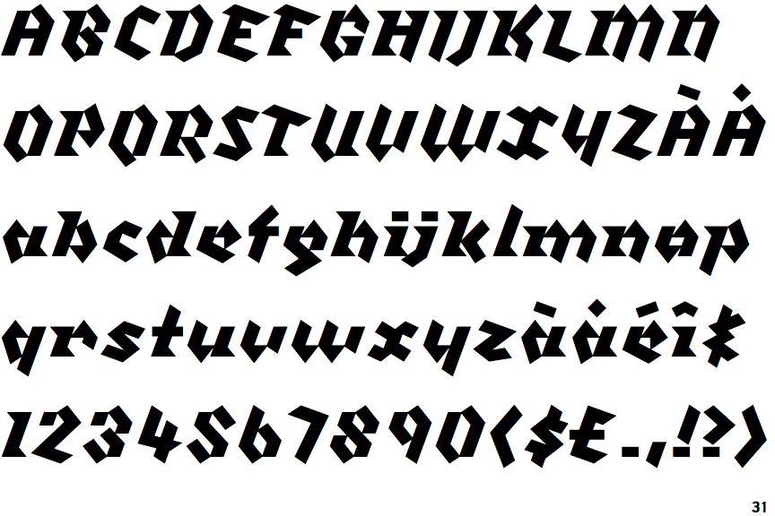
The strokes are sloped right (italic, oblique, or cursive).
|
 |
The sides of the lower-case 'y' are parallel (U-shaped).
|
 |
The lower-case 'u' has a stem/serif.
|
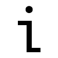 |
The lower-case 'i' has a left-facing upper serif and right-facing lower serif or tail.
|
 |
The lower-case 'i' or 'j' is lower than the k and l.
|
 |
The centre strokes of the upper-case 'W' form one centre stroke.
|
Note that the fonts in the icons shown above represent general examples, not necessarily the two fonts chosen for comparison.
Show Examples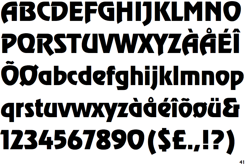
 |
The '&' (ampersand) looks like 'Et' with a gap at the top.
|
 |
The centre vertex of the upper-case 'M' is above the baseline.
|
 |
The upper-case 'Y' arms and tail are separate strokes.
|
 |
The 'l' (lower-case 'L') has no serifs or tail.
|
 |
The strokes are upright.
|
 |
The sides of the lower-case 'y' are angled (V-shaped).
|
 |
The lower-case 'u' has no stem/serif.
|
 |
The lower-case 'i' has no serifs or tail.
|
 |
The lower-case 'i' or 'j' is the same height as the k and l.
|
 |
The centre strokes of the upper-case 'W' meet at a vertex.
|