 |
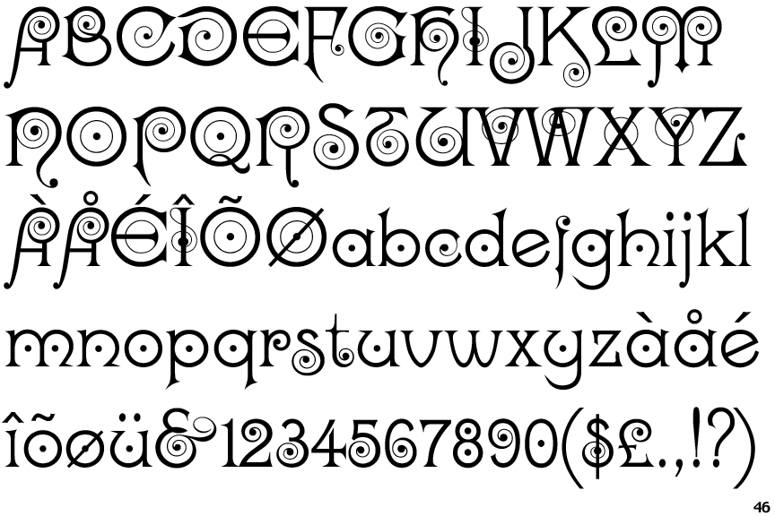
The '&' (ampersand) looks like 'Et' with a gap at the top.
|
 |
The upper-case 'E' is drawn as a 'C' with a bar.
|
 |
The foot of the '4' has double-sided serifs.
|
 |
The strokes are upright.
|
 |
The upper-case 'L' has no loops.
|
 |
The character outlines are smooth/sharp.
|
 |
The foot of the '£' (pound) has no loop.
|
Note that the fonts in the icons shown above represent general examples, not necessarily the two fonts chosen for comparison.
Show Examples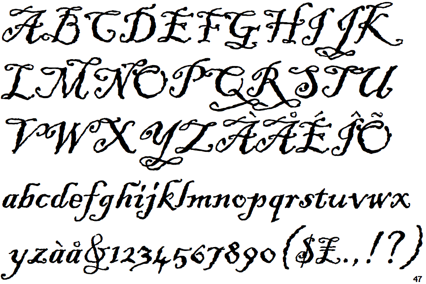
 |
The '&' (ampersand) is traditional style with two enclosed loops.
|
 |
The upper-case 'E' is normal letter shape.
|
 |
The foot of the '4' has no serifs.
|
 |
The strokes are sloped right (italic, oblique, or cursive).
|
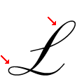 |
The upper-case 'L' has one upper and one lower loop.
|
 |
The character outlines are corroded, roughened, or dirty.
|
 |
The foot of the '£' (pound) has a loop.
|