 |
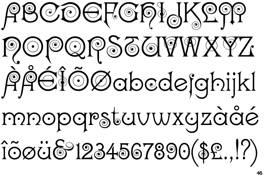
The '4' is open.
|
 |
The lower-case 'g' is single-storey (with or without loop).
|
 |
The upper-case 'U' has a stem/serif.
|
 |
The lower-case 'a' stem stops at the top of the bowl (single storey).
|
 |
The upper-case 'G' foot has a forward pointing spur or serif.
|
 |
The upper-case 'E' is drawn as a 'C' with a bar.
|
 |
The top of the upper-case 'W' has three upper terminals.
|
 |
The dot on the lower-case 'i' or 'j' is circular or oval.
|
 |
The feet of the lower-case 'h' have two serifs on the left and one on the right.
|
 |
The character outlines are smooth/sharp.
|
There are more than ten differences; only the first ten are shown.
Note that the fonts in the icons shown above represent general examples, not necessarily the two fonts chosen for comparison.
Show Examples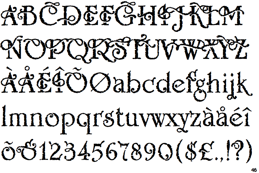
 |
The '4' is closed.
|
 |
The lower-case 'g' is double-storey (with or without gap).
|
 |
The upper-case 'U' has no stem/serif.
|
 |
The lower-case 'a' stem curves over the top of the bowl (double storey).
|
 |
The upper-case 'G' foot has no spur or serif.
|
 |
The upper-case 'E' is normal letter shape.
|
 |
The top of the upper-case 'W' has four upper terminals.
|
 |
The dot on the lower-case 'i' or 'j' is diamond-shaped.
|
 |
The feet of the lower-case 'h' have two serifs on each foot.
|
 |
The character outlines are corroded, roughened, or dirty.
|