Identifont

Fonts by Appearance

Fonts by Name

Fonts by Similarity

Fonts by Picture

Fonts by Designer/Publisher

Differences

TweetTweet Differences

Compare: and  

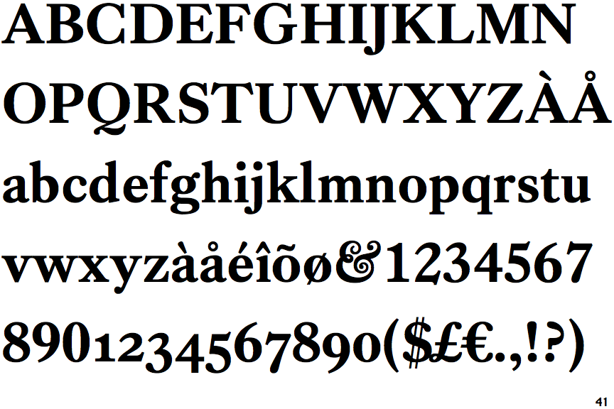
Kings Caslon Bold

Kings Caslon Bold

Double
The '$' (dollar) has a double line crossing the 'S'.
Gap top
The '&' (ampersand) looks like 'Et' with a gap at the top.
Below
The upper-case 'J' descends below the baseline.
None
The top of the upper-case 'A' has no serifs or cusps.

Note that the fonts in the icons shown above represent general examples, not necessarily the two fonts chosen for comparison.

Show Examples
Caslon No. 3

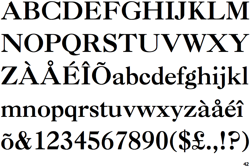
Caslon No. 3

Single
The '$' (dollar) has a single line crossing the 'S'.
Closed
The '&' (ampersand) is traditional style with two enclosed loops.
On
The upper-case 'J' sits on the baseline.
Left
The top of the upper-case 'A' has a serif or cusp on the left.