 |
The upper-case 'J' descends below the baseline.
|
 |
The diagonal strokes of the upper-case 'K' meet at the vertical (with or without a gap).
|
 |
The top of the upper-case 'A' has no serifs or cusps.
|
 |
The leg of the upper-case 'K' has two serifs.
|
 |
The stroke of the lower-case 'c' has a flat end or downward-pointing serif.
|
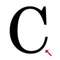 |
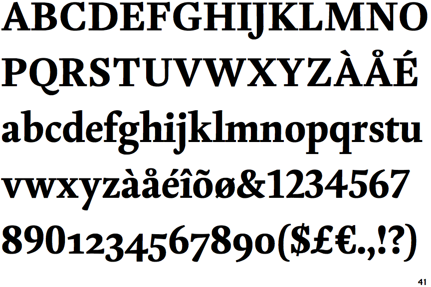
The lower stroke of the upper-case 'C' has no downward-pointing serif.
|
 |
The upper-case 'W' centre strokes meet at or near the top of the letter.
|
Note that the fonts in the icons shown above represent general examples, not necessarily the two fonts chosen for comparison.
Show Examples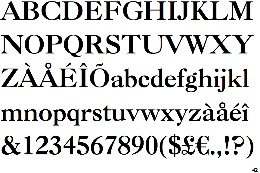
 |
The upper-case 'J' sits on the baseline.
|
 |
The diagonal strokes of the upper-case 'K' meet in a 'T'.
|
 |
The top of the upper-case 'A' has a serif or cusp on the left.
|
 |
The leg of the upper-case 'K' has a single right-pointing serif or foot.
|
 |
The stroke of the lower-case 'c' has a rounded end or ball.
|
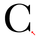 |
The lower stroke of the upper-case 'C' has a downward-pointing serif.
|
 |
The upper-case 'W' centre strokes meet below the top of the letter, with separate serifs.
|