 |
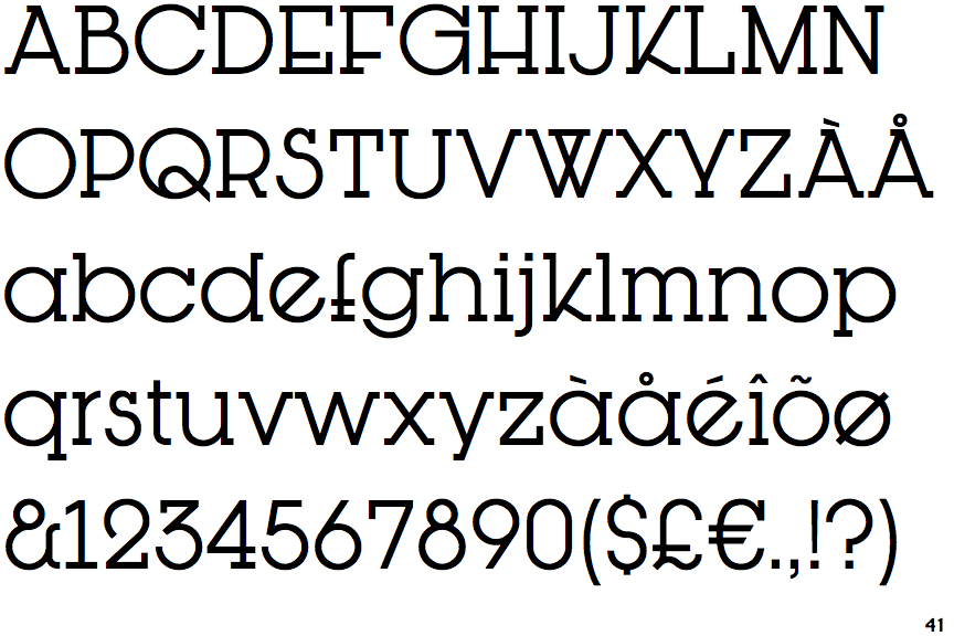
The upper-case 'Q' tail crosses the circle.
|
 |
The upper-case 'G' foot has no spur or serif.
|
 |
The top of the upper-case 'W' has four upper terminals.
|
 |
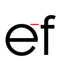
The lower-case 'e' has a straight angled bar.
|
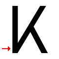 |
The arm of the upper-case 'K' meets the vertical at the baseline.
|
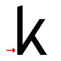 |
The arm of the lower-case 'k' meets the vertical at the baseline.
|
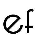 |
The bar of the lower-case 'f' is below the top of the lower-case letters.
|
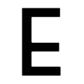 |
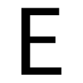
The centre bar of the upper-case 'E' is below centre.
|
Note that the fonts in the icons shown above represent general examples, not necessarily the two fonts chosen for comparison.
Show Examples
 |
The upper-case 'Q' tail touches the circle.
|
 |
The upper-case 'G' foot has a downward pointing spur.
|
 |
The top of the upper-case 'W' has three upper terminals.
|
 |
The lower-case 'e' has a straight horizontal bar.
|
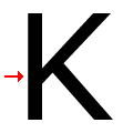 |
The arm of the upper-case 'K' meets the vertical above the baseline.
|
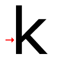 |
The arm of the lower-case 'k' meets the vertical above the baseline.
|
 |
The bar of the lower-case 'f' is level with the top of the lower-case letters.
|
 |
The centre bar of the upper-case 'E' is vertically central.
|