 |
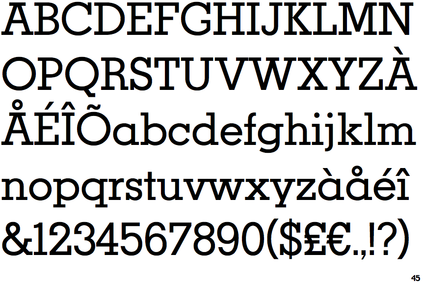
The upper-case 'J' sits on the baseline.
|
 |
The lower-case 'a' stem stops at the top of the bowl (single storey).
|
 |
The feet of the lower-case 'h' have two serifs on each foot.
|
 |
The feet of the lower-case 'm' have two serifs on each foot.
|
 |
The foot of the '£' (pound) has no loop.
|
Note that the fonts in the icons shown above represent general examples, not necessarily the two fonts chosen for comparison.
Show Examples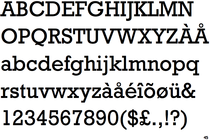
 |
The upper-case 'J' descends below the baseline.
|
 |
The lower-case 'a' stem curves over the top of the bowl (double storey).
|
 |
The feet of the lower-case 'h' have two serifs on the left and one on the right.
|
 |
The feet of the lower-case 'm' have two serifs on the left, and one on the centre and right.
|
 |
The foot of the '£' (pound) has a loop.
|