Identifont

Fonts by Appearance

Fonts by Name

Fonts by Similarity

Fonts by Picture

Fonts by Designer/Publisher

Differences

TweetTweet Differences

Compare: and  

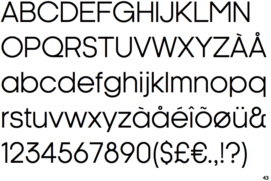
Kamerik 105

Kamerik 105

Above
The centre vertex of the upper-case 'M' is above the baseline.
Angled
The top storey of the '3' is a sharp angle.
1-Storey
The lower-case 'g' is single-storey (with or without loop).
1-Storey
The lower-case 'a' stem stops at the top of the bowl (single storey).

Note that the fonts in the icons shown above represent general examples, not necessarily the two fonts chosen for comparison.

Show Examples
Kamerik 205

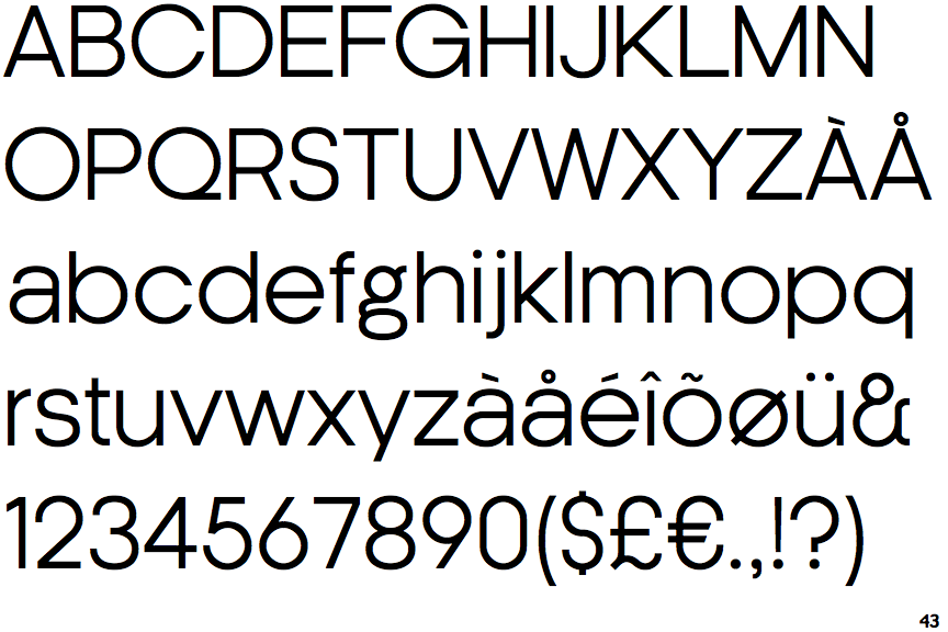
Kamerik 205

Baseline
The centre vertex of the upper-case 'M' is on the baseline.
Round
The top storey of the '3' is a smooth curve.
2-Storey
The lower-case 'g' is double-storey (with or without gap).
2-Storey
The lower-case 'a' stem curves over the top of the bowl (double storey).