 |
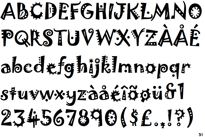
The upper-case 'Q' tail crosses the circle.
|
 |
The '&' (ampersand) looks like 'Et' with one enclosed loop (with or without exit stroke).
|
 |
The '4' is open.
|
 |
The top storey of the '3' is a sharp angle.
|
 |
The upper-case 'U' has no stem/serif.
|
 |
The centre bar of the upper-case 'R' meets the vertical.
|
 |
The upper-case letter 'I' is plain.
|
 |
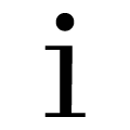
The lower-case 'i' has no serifs or tail.
|
 |
The upper-case 'I' is a single stroke with no serifs.
|
 |
The tail of the lower-case 't' is straight.
|
Note that the fonts in the icons shown above represent general examples, not necessarily the two fonts chosen for comparison.
Show Examples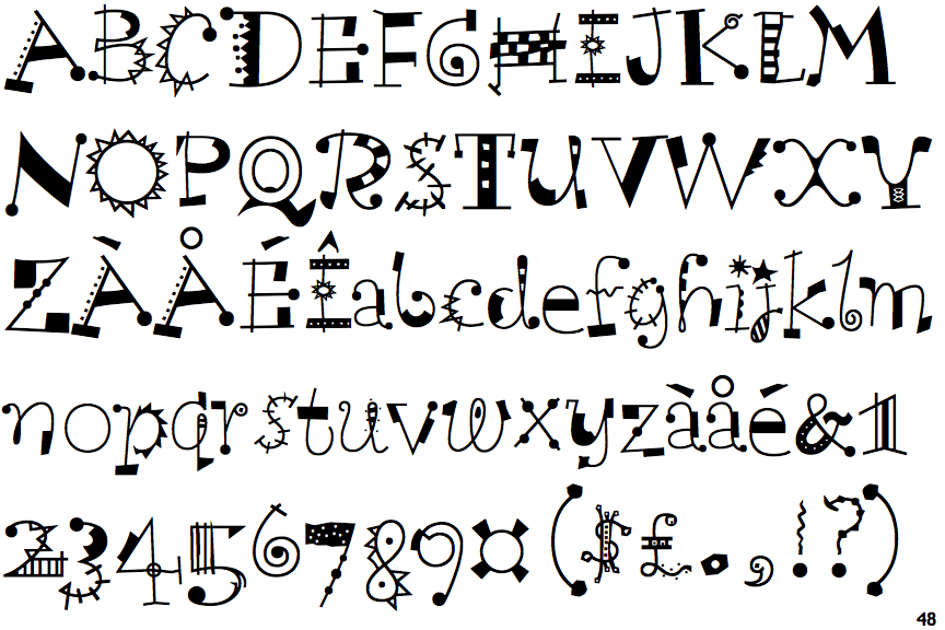
 |
The upper-case 'Q' tail touches the circle.
|
 |
The '&' (ampersand) is traditional style with two enclosed loops.
|
 |
The '4' is closed.
|
 |
The top storey of the '3' is a smooth curve.
|
 |
The upper-case 'U' has a stem/serif.
|
 |
The centre bar of the upper-case 'R' leaves a gap with the vertical.
|
 |
The upper-case letter 'I' has serifs/bars.
|
 |
The lower-case 'i' has a left-facing upper serif and double lower serifs.
|
 |
The upper-case 'I' is a single stroke with serifs.
|
 |
The tail of the lower-case 't' is curved.
|