 |
The '$' (dollar) has a single line crossing the 'S'.
|
 |
The upper-case 'J' descends below the baseline.
|
 |
The dot on the '?' (question-mark) is circular or oval.
|
 |
The top storey of the '3' is a smooth curve.
|
 |
The upper-case 'G' has no spur/tail.
|
|
The upper-case 'G' has no bar.
|
 |
The dot on the lower-case 'i' or 'j' is circular or oval.
|
 |
The lower storey of the lower-case 'g' has a gap.
|
 |
The lower-case 't' has double-sided bar which forms a diagonal with the vertical.
|
 |
The ends of the upper-case 'C' stroke are vertical or nearly vertical.
|
There are more than ten differences; only the first ten are shown.
Note that the fonts in the icons shown above represent general examples, not necessarily the two fonts chosen for comparison.
Show Examples
 |
The '$' (dollar) has a single line which does not cross the 'S'.
|
 |
The upper-case 'J' sits on the baseline.
|
 |
The dot on the '?' (question-mark) is square or rectangular.
|
 |
The top storey of the '3' is a sharp angle.
|
 |
The upper-case 'G' has a spur/tail.
|
 |
The upper-case 'G' has a bar to the left.
|
 |
The dot on the lower-case 'i' or 'j' is square or rectangular.
|
 |
The lower storey of the lower-case 'g' has no gap.
|
 |
The lower-case 't' has double-sided bar which forms a right-angle with the vertical.
|
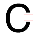 |
The ends of the upper-case 'C' stroke are horizontal or nearly horizontal.
|