 |
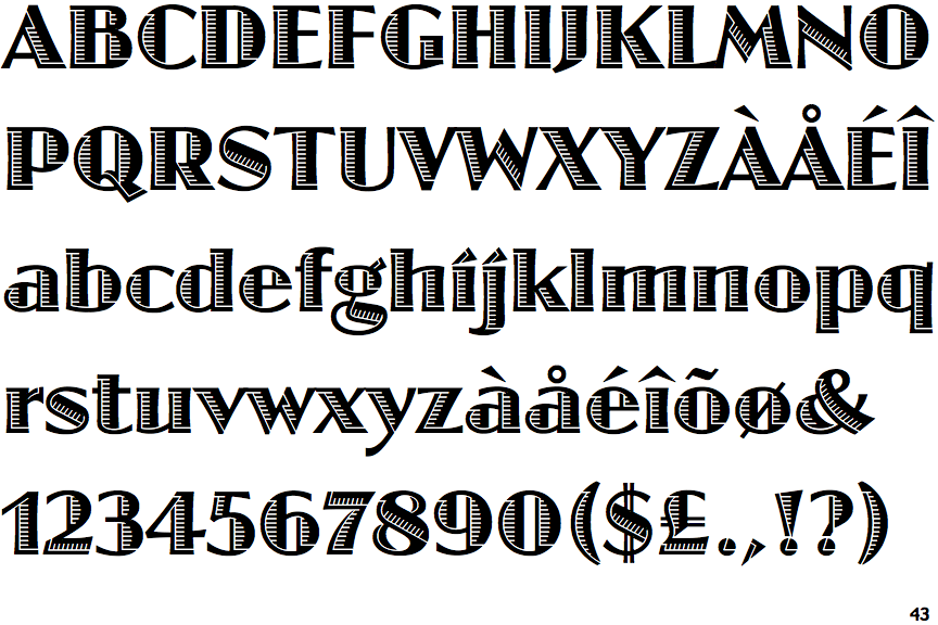
The '$' (dollar) has a double line crossing the 'S'.
|
 |
The '&' (ampersand) is traditional style with two enclosed loops.
|
 |
The verticals of the upper-case 'M' are sloping.
|
 |
The characters are outlined, shaded, or filled with a pattern.
|
 |
The upper-case 'G' has no bar.
|
 |
The right side of the upper-case 'G' has a flat section.
|
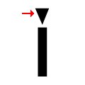 |
The dot on the lower-case 'i' or 'j' is triangular.
|
 |
The tail of the upper-case 'Q' is curved or S-shaped.
|
 |
The lower-case 'u' has a stem/serif.
|
 |
The lower storey of the lower-case 'g' has no gap.
|
There are more than ten differences; only the first ten are shown.
Note that the fonts in the icons shown above represent general examples, not necessarily the two fonts chosen for comparison.
Show Examples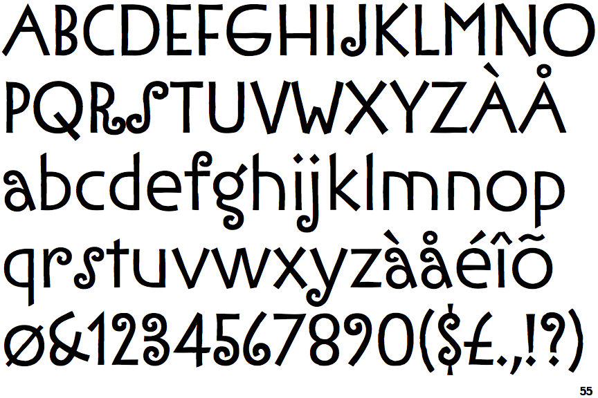
 |
The '$' (dollar) has a single line which does not cross the 'S'.
|
 |
The '&' (ampersand) is traditional style with a gap at the top.
|
 |
The verticals of the upper-case 'M' are parallel.
|
 |
The characters are solid.
|
 |
The upper-case 'G' has a bar to the left.
|
 |
The right side of the upper-case 'G' is curved.
|
 |
The dot on the lower-case 'i' or 'j' is diamond-shaped.
|
 |
The tail of the upper-case 'Q' is straight.
|
 |
The lower-case 'u' has no stem/serif.
|
 |
The lower storey of the lower-case 'g' has a gap.
|