 |
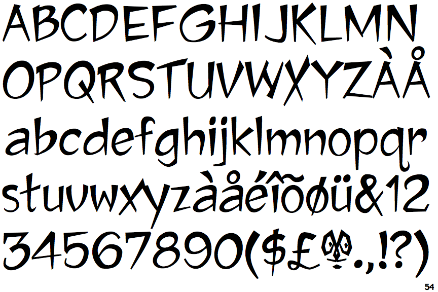
The upper-case 'Q' tail crosses the circle.
|
 |
The '&' (ampersand) is traditional style with two enclosed loops.
|
 |
The '4' is closed.
|
 |
The verticals of the upper-case 'M' are parallel.
|
 |
The upper-case 'U' has a stem/serif.
|
 |
The upper-case 'G' has a bar to the left.
|
 |
The upper-case 'Y' arms and tail are separate strokes.
|
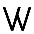 |
The centre strokes of the upper-case 'W' meet in a T on the right.
|
 |
The foot of the '£' (pound) has a loop.
|
Note that the fonts in the icons shown above represent general examples, not necessarily the two fonts chosen for comparison.
Show Examples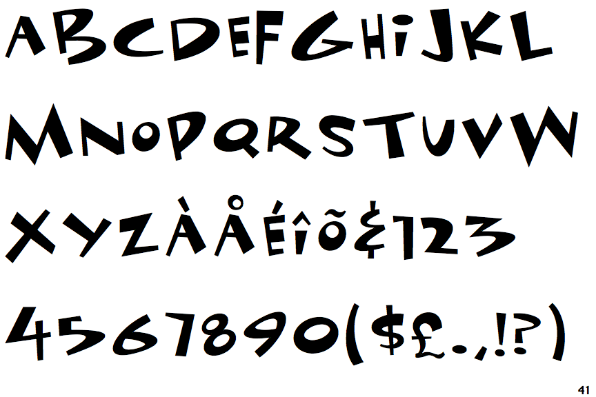
 |
The upper-case 'Q' tail touches the circle.
|
 |
The '&' (ampersand) looks like an 'E' with a solid or broken line.
|
 |
The '4' is open.
|
 |
The verticals of the upper-case 'M' are sloping.
|
 |
The upper-case 'U' has no stem/serif.
|
 |
The upper-case 'G' has double-sided bar.
|
 |
The upper-case 'Y' right-hand arm forms a continuous stroke with the tail.
|
 |
The centre strokes of the upper-case 'W' meet at a vertex.
|
 |
The foot of the '£' (pound) has no loop.
|