Identifont

Fonts by Appearance

Fonts by Name

Fonts by Similarity

Fonts by Picture

Fonts by Designer/Publisher

Differences

TweetTweet Differences

Compare: and  

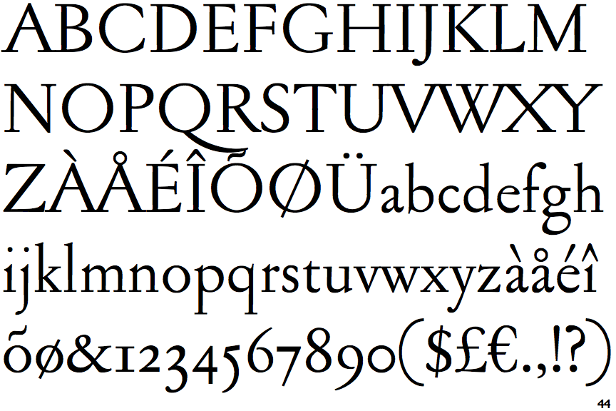
Jannon Antiqua

Jannon Antiqua

Single
The diagonal strokes of the upper-case 'K' meet at the vertical (with or without a gap).
Meets
The centre bar of the upper-case 'P' meets the vertical.
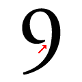
Open
The bowl of the '9' leaves a gap with the vertical.
Long
The tail of the upper-case 'Q' extends beyond the bowl width.

Note that the fonts in the icons shown above represent general examples, not necessarily the two fonts chosen for comparison.

Show Examples
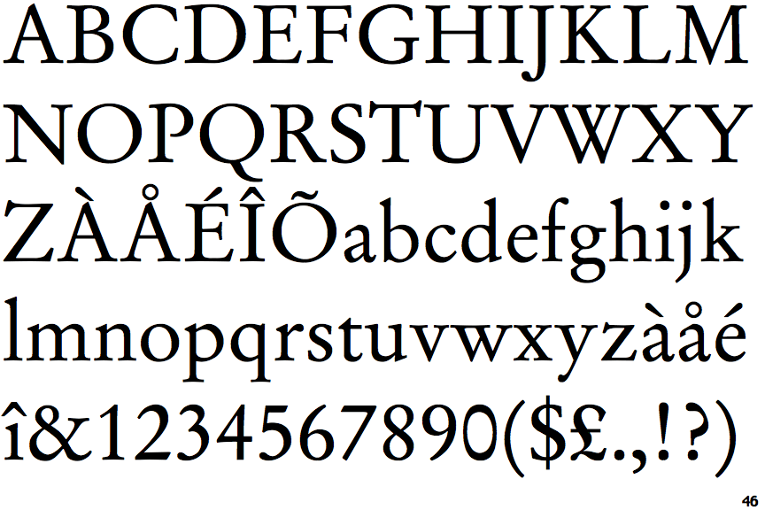
Stempel Garamond

Stempel Garamond

Double
The diagonal strokes of the upper-case 'K' meet in a 'T'.
Gap
The centre bar of the upper-case 'P' leaves a gap with the vertical.
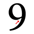
Closed
The bowl of the '9' meets the vertical.
Short
The tail of the upper-case 'Q' lies within the bowl width.