Identifont

Fonts by Appearance

Fonts by Name

Fonts by Similarity

Fonts by Picture

Fonts by Designer/Publisher

Differences

TweetTweet Differences

Compare: and  

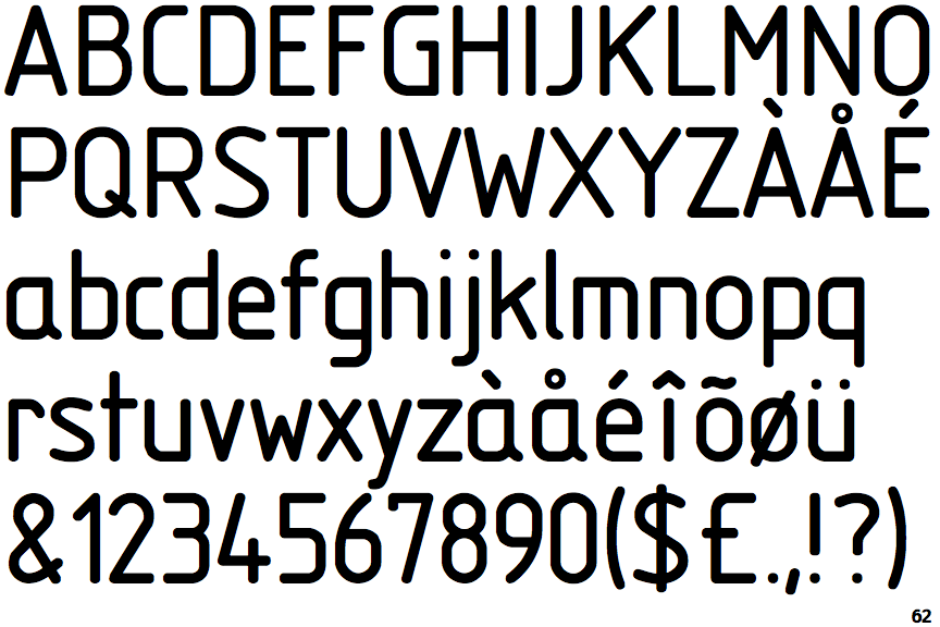
Isonorm

Isonorm

Closed
The '&' (ampersand) is traditional style with two enclosed loops.
1-Storey
The lower-case 'a' stem stops at the top of the bowl (single storey).
Missing
The top of the lower-case 'q' has no spur or serif.
Straight
The tail of the lower-case 't' is straight.

Note that the fonts in the icons shown above represent general examples, not necessarily the two fonts chosen for comparison.

Show Examples
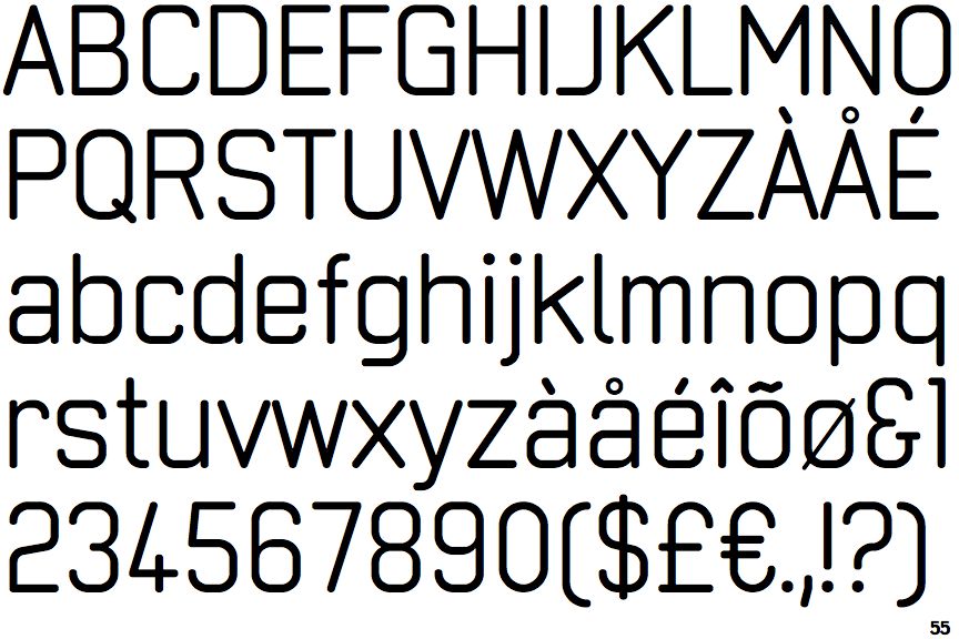
Neutraliser Sans

Neutraliser Sans

Gap top
The '&' (ampersand) looks like 'Et' with a gap at the top.
2-Storey
The lower-case 'a' stem curves over the top of the bowl (double storey).
Spur
The top of the lower-case 'q' has a vertical or slightly angled spur (pointed or flat).
Curved
The tail of the lower-case 't' is curved.