 |
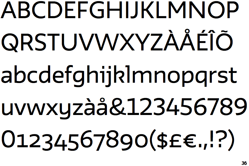
The '4' is open.
|
 |
The centre vertex of the upper-case 'M' is above the baseline.
|
 |
The verticals of the upper-case 'M' are parallel.
|
 |
The upper-case 'J' has no bar.
|
 |
The lower-case 'u' has a stem/serif.
|
 |
The '1' (digit one) has double-sided base or serifs.
|
 |
The upper-case letter 'I' is plain.
|
 |
The centre strokes of the upper-case 'W' meet at a vertex.
|
Note that the fonts in the icons shown above represent general examples, not necessarily the two fonts chosen for comparison.
Show Examples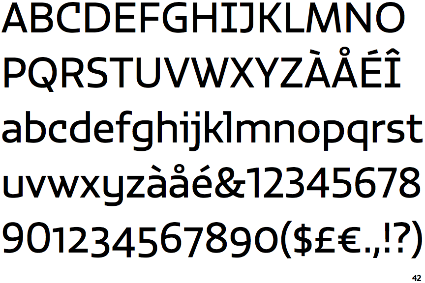
 |
The '4' is closed.
|
|
The centre vertex of the upper-case 'M' is on the baseline.
|
 |
The verticals of the upper-case 'M' are sloping.
|
 |
The upper-case 'J' has a bar to the left.
|
 |
The lower-case 'u' has no stem/serif.
|
 |
The '1' (digit one) has no base.
|
 |
The upper-case letter 'I' has serifs/bars.
|
 |
The centre strokes of the upper-case 'W' meet in a T on the left.
|