Identifont

Fonts by Appearance

Fonts by Name

Fonts by Similarity

Fonts by Picture

Fonts by Designer/Publisher

Differences

TweetTweet Differences

Compare: and  

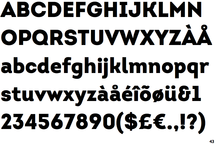
Intro Black

Intro Black

Parallel
The verticals of the upper-case 'M' are parallel.
Angled
The top storey of the '3' is a sharp angle.
Left
The upper-case 'G' has a bar to the left.
Three
The upper-case 'Y' arms and tail are separate strokes.
Curved
The right side of the upper-case 'G' is curved.
Serifs
The upper-case letter 'I' has serifs/bars.

Note that the fonts in the icons shown above represent general examples, not necessarily the two fonts chosen for comparison.

Show Examples
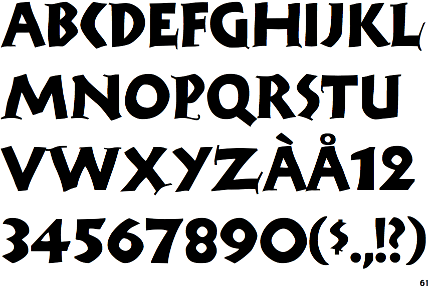
Rudolf

Rudolf

Sloping
The verticals of the upper-case 'M' are sloping.
Round
The top storey of the '3' is a smooth curve.
No bar
The upper-case 'G' has no bar.
Two
The upper-case 'Y' right-hand arm forms a continuous stroke with the tail.
Flat
The right side of the upper-case 'G' has a flat section.
Plain
The upper-case letter 'I' is plain.