 |
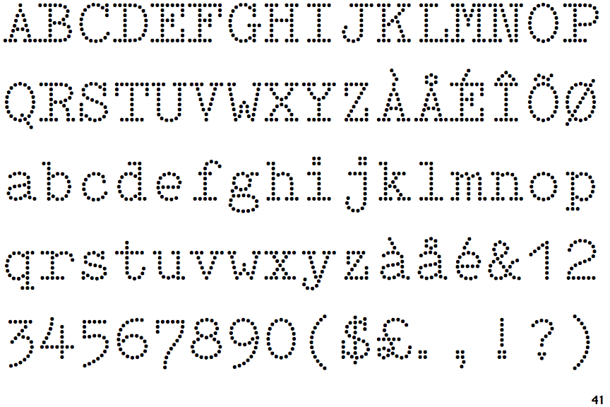
The characters have serifs.
|
 |
The centre vertex of the upper-case 'M' is above the baseline.
|
 |
The lower-case 'g' is double-storey (with or without gap).
|
 |
The upper-case 'Y' arms and tail are separate strokes.
|
 |
The upper-case 'A' has tapered verticals.
|
 |
The sides of the lower-case 'y' are angled (V-shaped).
|
 |
The '1' (digit one) has no base.
|
 |
The bar of the '4' crosses the vertical.
|
 |
The tail of the upper-case 'Q' is slanted.
|
Note that the fonts in the icons shown above represent general examples, not necessarily the two fonts chosen for comparison.
Show Examples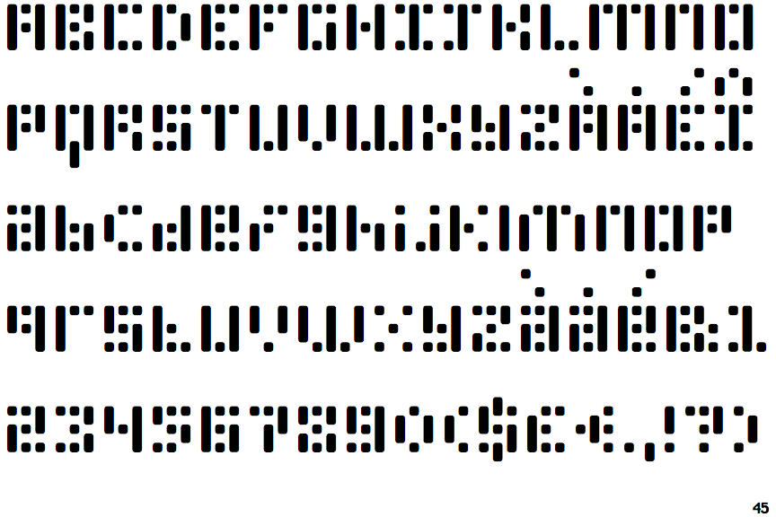
 |
The characters do not have serifs.
|
 |
The centre vertex of the upper-case 'M' is on the baseline.
|
 |
The lower-case 'g' is single-storey (with or without loop).
|
 |
The upper-case 'Y' right-hand arm forms a continuous stroke with the tail.
|
 |
The upper-case 'A' has parallel verticals.
|
 |
The sides of the lower-case 'y' are parallel (U-shaped).
|
 |
The '1' (digit one) has double-sided base or serifs.
|
 |
The bar of the '4' does not cross the vertical.
|
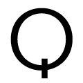 |
The tail of the upper-case 'Q' is vertical.
|