Identifont

Fonts by Appearance

Fonts by Name

Fonts by Similarity

Fonts by Picture

Fonts by Designer/Publisher

Differences

TweetTweet Differences

Compare: and  

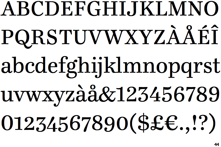
Ingeborg

Ingeborg

On
The upper-case 'J' sits on the baseline.
Open
The '4' is open.
Angled
The top storey of the '3' is a sharp angle.
Spur
The upper-case 'G' foot has a downward pointing spur.
None
The foot of the '4' has no serifs.

Note that the fonts in the icons shown above represent general examples, not necessarily the two fonts chosen for comparison.

Show Examples
Monotype Century Old Style

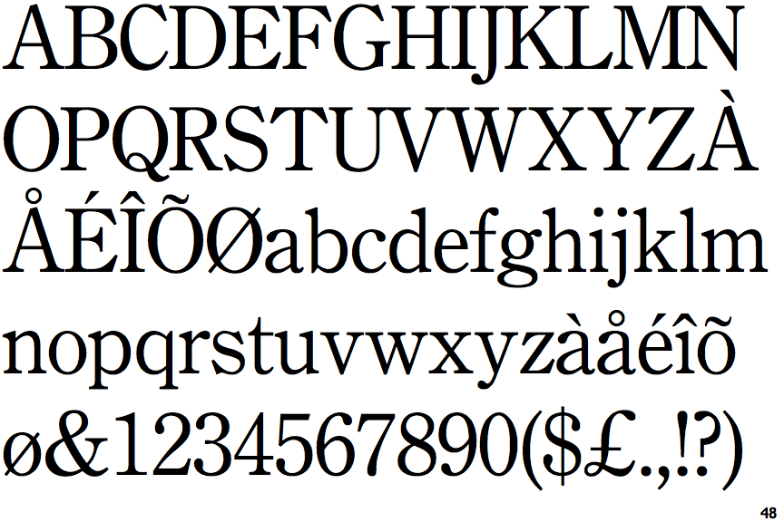
Monotype Century Old Style

Below
The upper-case 'J' descends below the baseline.
Closed
The '4' is closed.
Round
The top storey of the '3' is a smooth curve.
No-Spur
The upper-case 'G' foot has no spur or serif.
Double
The foot of the '4' has double-sided serifs.