 |
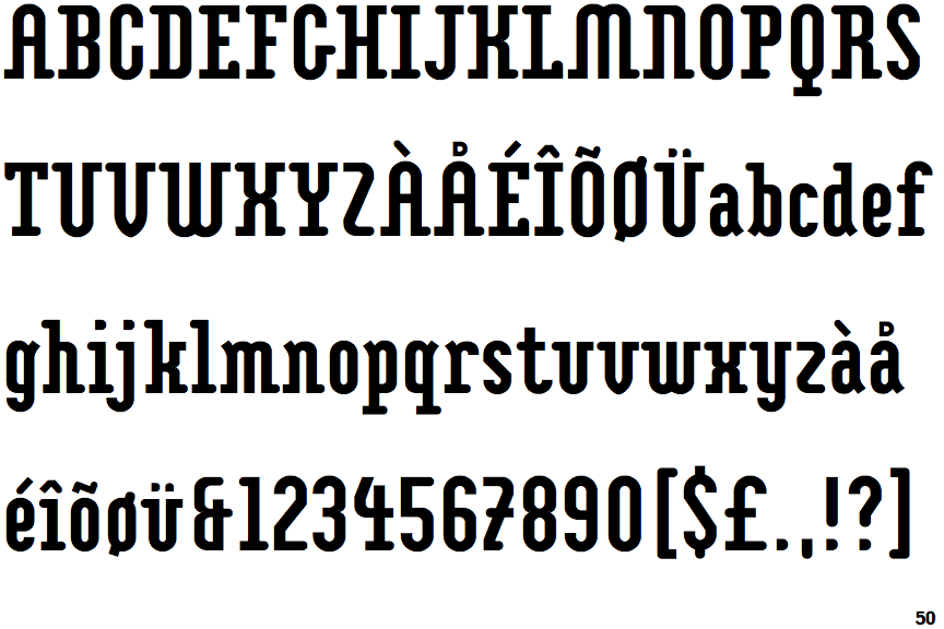
The '&' (ampersand) looks like 'Et' with one enclosed loop (with or without exit stroke).
|
 |
The diagonal strokes of the upper-case 'K' connect to the vertical via a horizontal bar.
|
 |
The top storey of the '3' is a smooth curve.
|
 |
The top of the upper-case 'A' has no serifs or cusps.
|
 |
The top stroke of the upper-case 'C' has no upward-pointing serif.
|
 |
The upper-case 'G' foot has no spur or serif.
|
 |
The upper-case 'A' has parallel verticals.
|
 |
The sides of the lower-case 'y' are parallel (U-shaped).
|
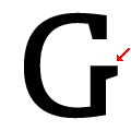 |
The bar of the upper-case 'G' is single-sided, right-facing.
|
 |
The lower-case 'e' has a curved bar with no straight segment.
|
There are more than ten differences; only the first ten are shown.
Note that the fonts in the icons shown above represent general examples, not necessarily the two fonts chosen for comparison.
Show Examples
 |
The '&' (ampersand) is traditional style with two enclosed loops.
|
 |
The diagonal strokes of the upper-case 'K' meet in a 'T'.
|
 |
The top storey of the '3' is a sharp angle.
|
 |
The top of the upper-case 'A' has a serif or cusp on the left.
|
 |
The top stroke of the upper-case 'C' has a vertical or angled upward-pointing serif.
|
 |
The upper-case 'G' foot has a downward pointing spur.
|
 |
The upper-case 'A' has tapered verticals.
|
 |
The sides of the lower-case 'y' are angled (V-shaped).
|
 |
The bar of the upper-case 'G' is single-sided, left-facing.
|
 |
The lower-case 'e' has a straight horizontal bar.
|